
Although I am usually known as a portrait painter, I love to paint small still life now and then. Also, “likeness” is never an issue in a still life…who will argue if I capture the exact “likeness” of a particular apple?
I enjoy painting objects in ideal light and thus invite the viewer to see the astounding beauty in the simple things that we often overlook in our busy everyday lives.
I begin by choosing one particular theme (like “grapes & glass” in this example) – and then begin to photograph this in as many different ways I can think of with minor variations of materials, position, and lighting.
This is now much easier than it used to be because of the low cost of digital photography. Because I am better with a brush than a camera, I take a lot of “mistake” photos that I can toss away without regret.
I prefer to use photographic reference over “real life” because: 1) Fruit doesn’t last. 2) I often take a long time to apply paint in layers that need to dry first. 3) I cannot count on my feisty Studio Cat to leave my setup alone. 4) I don’t have a studio large enough to set up a long-term still life that cannot be touched or moved. 5) Sometimes I get busy with portraits and will wait weeks or months between still life painting sessions.
This is the reference photo I shot today:
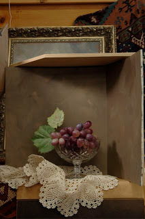
This is the best reference shot of the lot (above) - unedited.

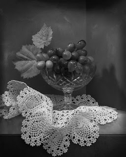
SAme photo but I have cropped and adjusted this photo in Photoshop with a small 8” x 10” still life painting in mind. I darkened the edges and darkened the light falling on the top leaf as it was distracting. In the final painting I would add some highlights here without increasing the overall value.
I will print and put this photo in a file and later decide I may paint a still life from it. I usually sleep on this decision at least overnight. I may decide to reshoot in order to perfect and “tweak it” a bit.
I have found that spending a LOT of time on the planning end will save endless frustrating hours with a paintbrush in my hand trying to correct fundamental mistakes. If a particular photo doesn’t “have it” and you cannot make it “right” – it will be hard to make a successful painting based on it.
The photo must look good in black and white. I am not entirely sure that the lacy cloth doesn’t overwhelm the grapes in its value. I need to think about how I wish to compensate for this. Sometimes I may need to make a charcoal or graphite drawing in order to figure out the correct value and composition.
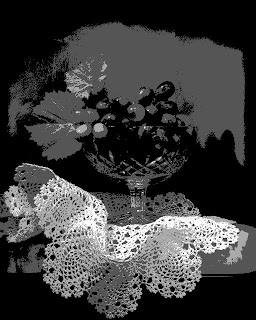
I always take a peek at a photo in the Photoshop “Poster” filter. It will show me the massing of values and help me find the “center of light.”
I like to determine the underlying abstractions that may need to be adjusted.

In the case of the above photo I imposed "more interesting" negative abstract shapes in the background. I think that this will give the final painting much more "strength".
I think that all good realistic paintings have solid abstractions that lie underneath the surface.
Shadows are very important elements of composition and this is a useful way to see them.
I think that all good realistic paintings have solid abstractions that lie underneath the surface.
Shadows are very important elements of composition and this is a useful way to see them.


No comments:
Post a Comment