Portrait of Grayson


Portrait of Grayson
20" x 24" Oil on Linen

I won two awards for this portrait of Grayson Gibbs:

Winner, Special Recognition Award,
1998 International Juried "Portraits Only" Competition, Washington Society of Portrait Artists, Washington, DC

and also

First Prize Winner,
American Society of Portrait Artists, 1997 Portrait Arts Festival Competition, Montgomery Alabama.
Portrait artist Karin Wells, Historical Portraits

How Ivory Black + White = Blue


With the "Earth Palette" I can use a mixture of Ivory Black and Titanium White to make what appears to be the color blue.

When using an earth palette, this mixture does NOT make gray, really!

All of the so-called “blue” in my paintings are made from this and you can see it in the examples below.

In fact the blue from an Ivory Black and White mixture is so "electric" I often need to tone it down by adding some reds and/or yellows.

If I wish to deepen and enrich an area of this mixture of "blue," I could glaze a little French Ultramarine or Prussian Blue over it....but rarely, if ever, need to do this.

None of the examples below have any glazed colors to make the blues look bluer - they are all a black/white mixture - and most have yellow or red added to calm it down.


The drapery behind the figure is purely black + white. The black/white mixture in the sky is cut with raw umber and raw sienna.


I added a little red into these black and white mixtures to get a blue that is a bit on the purple side.


The sky is basically black and white with some reds added for warmth near the horizon line. I darkened and slightly neutralized the blue at the top of the canvas so as not to draw the eye upwards.


Again, the black/white mixture needed to be cut with raw sienna because it was much too bright for a background.


I began the blue checkered tablecloth by mixing a thin glaze of French Ultramarine + Ivory Black to sketch in a pattern of checks over a plain white painted cloth underneath.

When it was dry, I matched the paint value with the black/white mixture and covered it up in order to create the ilusion of a blue checkered tablecloth.

Of course, the shadow areas were a darker black/white mixture with raw sienna added for warmth (shadows are supposed to be warm).

Take a peek at my black & white sky at:
http://karinwells.blogspot.com/2008/03/cliff-landscapes.html

With this particular earth palette, I cannot paint a landscape and make a sky look "natural" if I use any blue paint on my canvas.

When I was learning to paint, I copied the Old Masters - I especially learned most of what I know from Vermeer. I quickly learned that I was unable to duplicate the colors unless I eliminated the blues.

My Old Masters Earth Palette

I use a basic Old Master’s Earth Palette. It consists of the three primary colors; red, yellow and blue. And, of course, black and white.


My palette includes both warm and cool colors in each color family. The temperature of a color is relative to the colors surrounding it. For example, yellows are generally thought to be warm – but in that “color family” the Lemon Yellow Hue is cooler than the Indian Yellow.


French Ultramarine is a cool blue color and Prussian Blue is a warm blue color. Except to glaze, I seldom use these blue paints.

With this particular earth palette, a mixture of Ivory Black and White will make a color that “reads” as blue. The “blues” in my paintings are made from this. If I need to deepen and enrich a "blue" in my painting, I tend to use these tubed blue colors to glaze only.


Indian Red warm. Mixed with Cadmium Orange it makes a deep rich Vermillion color.

I only use Permanent Alizarin Crimson because it archival and long lasting.

Red pigments have been historically among the most fugitive colors. This degeneration rarely occurs in synthetic or natural inorganic pigments. Although modern chemistry has made spectacular advances in filling in this part of the color space, I feel that within this group of colors you must read your labels and choose wisely.

Professional ethics (if not common decency) means informing your clients when a work contains a fugitive color (such as alizarin crimson), so that collectors can decide for themselves whether they want to accept the risk.


Although it paints wonderfully, I do not use flake white as it contains lead. Gamblin makes a Flake White Replacement that is non-toxic.

I mostly use Titanium White as it is opaque and dries rather quickly.

Zinc White** is translucent and does not cover well. However, it is a useful color to “cool” an area.

About Acrylic Paints:
If when I have occassion to use them, I prefer the earth colors of Liquitex Basic Matt Colors.

**NOTE: Since my original post about Zinc White I have discovered that there are problems with paintings that contain Zinc White. See this post and this article.

Ivory Black is a nice warm black and I mostly use it as a glaze, to turn an edge or mixed with white to make a color that appears “blue.” Ivory Black cannot be use thickly by itself or it will crack.

Ivory Black also takes longer to dry than most other colors.

To make the color “black” I often mix Prussian Blue and Burnt Umber and glaze it into an area. It is better to add several layers of glaze to get the dark color you wish than attempt to use one coat of thick paint.

Opaque colors are usually applied thickly. Transparent and translucent colors – when used alone - need to be kept very thin.

Making a Photo Reference for Still Life #2

When I shoot a still life or a portrait, I always have a miniature theatrical stage in the back of my mind. I am trying to to create a little one act play - all costume and atmospheric lighting - no script.

In order to save my back, I use a high shelf in my studio to set up my still life for a shoot. I use brown wrapping paper to simulate a “table top” and matte black paper to “fake” an edge beneath.


I always use a tripod to prevent "wiggle" because I like to shoot with the smallest aperture for the clearest "in focus" picture I can get.


I have used an ordinary hardware store light and a low watt fluorescent bulb. I use fluorescent because the light is more diffuse and the shadows less harsh. I have used black construction paper to direct the light in a more theatrical way.

I like a box in order to “trap” the light. I use movable cardboard flaps to create shadows where I want them.

I anchor objects with masking tape, pins and even glue if necessary where it doesn’t show.

In my setup for a shoot I try to create a foreground – in this case it is where the drape spills over the table edge. A middle ground is the container of fruit. And a background – a piece of bent cardboard painted (aprox a 50% value) with either a neutral warm or cool color…and sometimes both.

Larger still lifes obviously require a larger setup.

Here are some rejects:


Besides the subject matter (bowl of grapes) being too dark overall, the white cloth at the bottom would become the focus. I could paint a pattern, embroidery, lace or somesuch to change this if necessary.


All is too bright - no atmosphere nor interesting shadow patterns here.


This is better and more interesting with off-white lace rather than a solid stark white cloth. However, I do not like the arrangement of the cloth. The leaves caught too much of the light and in the final painting would overwhelm the light on the grapes.


This is a screen shot of an iPhoto file on my Mac. You can see some of the volume of photos I took and rejected in order to get just one "workable" photo reference for a still life.

Note that I save all my rejects until my painting is completed. Often I will be inspired by some elements from the rejects that I like better than ones in my main reference. For example, adding a grape that fell onto the tabletop, a more interesting highlight on a leaf, or a better shape created by a cast shadow.

Shooting photographic reference for still life is so much easier than shooting the reference for a portrait. Portraits are more involved, complicated and can sometimes be stressful when time is limited. When this happens, I set up my entire shoot in advance and “test” the lighting so I don't have to fiddle around and waste time with too much technical stuff.

Making a Photo Reference for Still Life #1

Although I am usually known as a portrait painter, I love to paint small still life now and then. Also, “likeness” is never an issue in a still life…who will argue if I capture the exact “likeness” of a particular apple?

I enjoy painting objects in ideal light and thus invite the viewer to see the astounding beauty in the simple things that we often overlook in our busy everyday lives.

I begin by choosing one particular theme (like “grapes & glass” in this example) – and then begin to photograph this in as many different ways I can think of with minor variations of materials, position, and lighting.

This is now much easier than it used to be because of the low cost of digital photography. Because I am better with a brush than a camera, I take a lot of “mistake” photos that I can toss away without regret.

I prefer to use photographic reference over “real life” because: 1) Fruit doesn’t last. 2) I often take a long time to apply paint in layers that need to dry first. 3) I cannot count on my feisty Studio Cat to leave my setup alone. 4) I don’t have a studio large enough to set up a long-term still life that cannot be touched or moved. 5) Sometimes I get busy with portraits and will wait weeks or months between still life painting sessions.

This is the reference photo I shot today:


This is the best reference shot of the lot (above) - unedited.


SAme photo but I have cropped and adjusted this photo in Photoshop with a small 8” x 10” still life painting in mind. I darkened the edges and darkened the light falling on the top leaf as it was distracting. In the final painting I would add some highlights here without increasing the overall value. 

I will print and put this photo in a file and later decide I may paint a still life from it. I usually sleep on this decision at least overnight. I may decide to reshoot in order to perfect and “tweak it” a bit.

I have found that spending a LOT of time on the planning end will save endless frustrating hours with a paintbrush in my hand trying to correct fundamental mistakes. If a particular photo doesn’t “have it” and you cannot make it “right” – it will be hard to make a successful painting based on it.


The photo must look good in black and white. I am not entirely sure that the lacy cloth doesn’t overwhelm the grapes in its value. I need to think about how I wish to compensate for this. Sometimes I may need to make a charcoal or graphite drawing in order to figure out the correct value and composition.


I always take a peek at a photo in the Photoshop “Poster” filter. It will show me the massing of values and help me find the “center of light.” 

I like to determine the underlying abstractions that may need to be adjusted. 


In the case of the above photo I imposed "more interesting" negative abstract shapes in the background. I think that this will give the final painting much more "strength".

I think that all good realistic paintings have solid abstractions that lie underneath the surface.

Shadows are very important elements of composition and this is a useful way to see them.

Handling Strong Diagonals in Composition

Sometimes I see the use of strong diagonals in a painting leading the eye directly into corners of the canvas. This makes for a very dull and static composition. 


No matter how well drawn, artworks won't "work" if the composition is poor. 

In order to make a better composition, I work to offset these diagonals so that they miss the corners.

A primary rule of composition is to "make nothing equal." This includes both positive and negative space.

I have illustrated this concept below in the most simple way I can think of.


In this illustration the composition is static and boring as the diagonals bisect the corners - an artistic no-no.


This illustration (above) makes for a better composition as it misses the corners and offers unequal and thus better shapes.


This last illustration takes exactly the same elements and rearranges them (in just one of any  zillion "right" ways) to make the most interesting composition of these three. Both the positive and negative shapes are (relative to each other ) "unequal."

Achieving Traditional Lighting for Photographic Reference


Note: This article was originally written about film photography but I have expanded it to include the digital photography I now use. 

I include both because a lot of artists have not switched to digital...but I sure do recommend the new technology!


I've always loved the paintings of the Old Masters and often have copied their works in order to understand the masters' use of light and composition.

Their lighting is simple, elegant, and comes from a single light source. Over the years, I've devised a method of achieving this single source lighting with the use of my camera and artificial illumination equipment.

Because I personally find a natural daylight source to be inconsistent and often paint into the night without a model, I heavily rely on my camera for reference "notes".

I've found that it is difficult, if not impossible to produce a good portrait from a poor photograph. For example, shadows that look wonderful when you have the model sitting before you, can unhappily appear as solid black in the resulting photograph.

Traditional photography can tend to clump and exaggerate values on both extremes of the value scale – shadows become dense and “black” and highlights often become burned-out and pure white.

My goal is to take the best photographic reference possible in order to see into dense shadows and compensate in painting by consciously making shadows luminous while retaining detail in the light.

Another inferior result comes from the use of high-speed film in low light, making the photo grainy. There are two variables that determine how much light intensity is needed - lens aperture and film speed.

The faster the film speed and the larger the aperture setting, the more grainy and inferior the resulting photo. What a portrait artist needs is sharp, brilliant pictures with good depth of field. The only way to get this, especially with moving children, is to have lots of steady light, a slow speed film, and moderate or high apertures.

The placement of the light in relationship to the subject is critical. As a rule of thumb, when photographing most clients, I set up my light to the left of the camera and above the subject. This placement will produce shadows appearing in a pattern that photographers call, "Rembrandt Lighting".

Since paintings, like books, read from left to right and top to bottom, this direction of light is oftentimes the most pleasing. With older clients, I like to keep the lighting as frontal as possible in order to minimize the appearance of creases and wrinkles on the skin.

To reflect light back into the shadow slide of the model (so that the shadows don't look black in the resulting photo), I place reflectors (white cardboard will do) opposite the light source and "off camera". Bounce more light than your eye tells you to back into the shadows, so that you will be able to see detail within the shadows.

Most professional photographers use another light to accomplish this, but I urge you to resist the temptation. I find that the results can be excellent when served by a single light source and a reflecting board.

I often photograph my subject with a neutral background. My discovery of a portable "Background System in a Bag" by Photek, makes traveling to the client's location a breeze. It consists of a large, 8'x12', pearl gray material with collapsible supports. In composing the actual painting, this neutral background allows me the flexibility to add objects or landscapes that I've photographed separately.

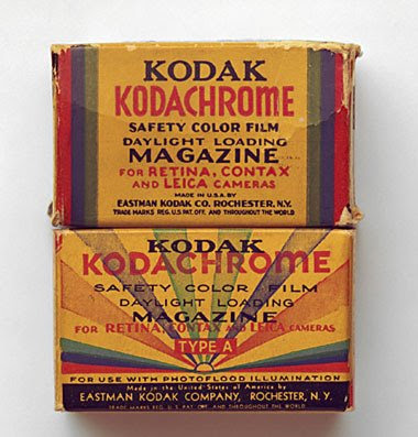
In my old film camera, I prefered a slow (160 ISO) professional film, Kodak Portra. It is a professional film that gave me accurate skin tones, clear detail, and soft shadows.

I now use a 35mm Nikon D2X digital camera (auto focus) with a Nikkor 24-120mm zoom lens. This digital camera works beautifully with all of the equipment listed here.

There are many advantages to using a digital camera nowadays – the technology has advanced so that it rivals film quality and is much less expensive as there are no film costs. It allows the photographer to “process” and adjust the photos at home on their own computer and make their own quality prints.

The "White Lightning Ultra 600" studio flash manufactured by Paul C. Buff, Inc. of Nashville, TN., illuminates the subject while showing exactly where the shadows fall. It is lightweight and portable, and allows me to shoot at a faster speed, thus eliminating the absolute need for a tripod. I have found that it is essential for me to have this kind of a strobe light in order to be able to photograph a small child who cannot be expected to sit still.


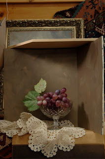
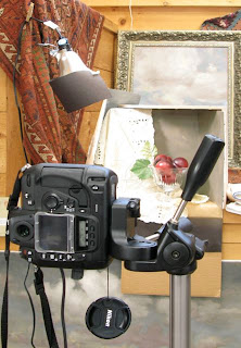
This picture (above) shows how I shoot a still life for reference with my digital camera. I am not using a strobe because it is unnecessary as nothing is expected to move. I am using an ordinary hardware store bulb and fixture - the digital camera will automatically compensate to make the color temp appear "normal."

Without a strobe light, it is often necessary to use a sturdy tripod in order to get sharp clear and perfect focus prints.

I find that a light modifier provides light that wraps gently around the form. I use the Apollo 28" square model with a recessed diffuser panel. It is manufactured by Wescott and attaches to my studio flash unit like an umbrella.

I also use a Wein light meter (any will do) to determine the aperture on my camera. When I click the shutter, a strobe ring at the base of the modeling light automatically flashes and illuminates the subject with the correct amount of light.

With my digital camera and when I am shooting in my studio, I do not use the light meter – instead I use the computer to “see” what adjustments may be necessary in my lighting and set up.

It takes time, study and practice to produce beautifully lighted photographs for use in portraiture. My system has worked well for me to mimic the single light source.

Resources

Studio flash unit:
Paul C. Buff , Inc.
www.white-lightning.com

All other equipment, both new and used:
B&H Photo
www.bhphotovideo.com

"Winslow" Art Card


"Winslow" Giclée Art Card

With Winslow on patrol, my studio remains a blissfully mouse -free zone.

This is an original Giclée Art Print and is made from my original oil painting. Card, envelope and insert shown above. This is a signed Open Edition.

Giclées (zhee-clays) are exceptionally high resolution reproductions made on a specialty large format printer. This museum quality giclee is printed on a 100% cotton rag fine art paper. The finely ground pigments I have used are made from the same pigments used in the finest quality artist watercolors and oil paints.

Cello packaged, hand signed and assembled in an earth-toned 5" x 7" paper frame as shown with a lighter, warmer earth-toned envelope.

$10.00 each card
Plus $3.00 shipping with the USA (up to 6 cards in pkg)
PayPal & check friendly, to email me see "Contact"

"Wellscroft Sheep" Art Card


"Wellscroft Sheep" Giclée Art Card

Sheep have been feeding and clothing man for more than 8,000 years. They are such a delightful part of our beautiful New Hampshire landscape and I love to draw and paint them.

This is an original Giclée Art Print and is made from my original oil painting. Card, envelope and insert shown above. This is a signed Open Edition.

Giclées (zhee-clays) are exceptionally high resolution reproductions made on a specialty large format printer. This museum quality giclee is printed on a 100% cotton rag fine art paper. The finely ground pigments I have used are made from the same pigments used in the finest quality artist watercolors and oil paints.

Cello packaged, hand signed and assembled in an earth-toned 5" x 7" paper frame as shown with a lighter, warmer earth-toned envelope.

$10.00 each card
Plus $3.00 shipping with the USA (up to 6 cards in pkg)
PayPal & check friendly, to email me see "Contact"

"Two Weeks Old" Art Card


"Two Weeks Old" Giclée Art Card

The powerful potential of any child to become an extraordinary human being is truly a miracle. I have painted a lot of small children but this little guy is my youngest portrait subject.

This is an original Giclée Art Print and is made from my original oil painting. Card, envelope and insert shown above. This is a signed Open Edition.

Giclées (zhee-clays) are exceptionally high resolution reproductions made on a specialty large format printer. This museum quality giclee is printed on a 100% cotton rag fine art paper. The finely ground pigments I have used are made from the same pigments used in the finest quality artist watercolors and oil paints.

Cello packaged, hand signed and assembled in an earth-toned 5" x 7" paper frame as shown with a lighter, warmer earth-toned envelope.

$10.00 each card
Plus $3.00 shipping with the USA (up to 6 cards in pkg)
PayPal & check friendly, to email me see "Contact"

"Summertime" Art Card


"Summertime" Giclée Art Card

At the lake, this little swimmer tests the water with her toes before she jumps in.

This is an original Giclée Art Print and is made from my original oil painting. Card, envelope and insert shown above. This is a signed Open Edition.

Giclées (zhee-clays) are exceptionally high resolution reproductions made on a specialty large format printer. This museum quality giclee is printed on a 100% cotton rag fine art paper. The finely ground pigments I have used are made from the same pigments used in the finest quality artist watercolors and oil paints.

Cello packaged, hand signed and assembled in an earth-toned 5" x 7" paper frame as shown with a lighter, warmer earth-toned envelope.

$10.00 each card
Plus $3.00 shipping with the USA (up to 6 cards in pkg)
PayPal & check friendly, to email me see "Contact"

"Rag Doll" Art Card


"Rag Doll" Giclée Art Card

This was a studio prop that sat on my windowsill and watched me paint. My rag doll eventually found a good home with a charming little visitor who fell in love with her.

This is an original Giclée Art Print and is made from my original oil painting. Card, envelope and insert shown above. This is a signed Open Edition.

Giclées (zhee-clays) are exceptionally high resolution reproductions made on a specialty large format printer. This museum quality giclee is printed on a 100% cotton rag fine art paper. The finely ground pigments I have used are made from the same pigments used in the finest quality artist watercolors and oil paints.

Cello packaged, hand signed and assembled in an earth-toned 5" x 7" paper frame as shown with a lighter, warmer earth-toned envelope.

$10.00 each card
Plus $3.00 shipping with the USA (up to 6 cards in pkg)
PayPal & check friendly, to email me see "Contact"

"Portrait of Fluffy" Art Card


"Portrait of Fluffy" Giclée Art Card


Fluffy is an unusually beautiful and elegant feral cat and it is always a challenge to paint or draw her. She can sometimes be bribed with food - but not nearly as often as I would like.

This is an original Giclée Art Print and is made from my original oil painting. Card, envelope and insert shown above. This is a signed Open Edition.

Giclées (zhee-clays) are exceptionally high resolution reproductions made on a specialty large format printer. This museum quality giclee is printed on a 100% cotton rag fine art paper. The finely ground pigments I have used are made from the same pigments used in the finest quality artist watercolors and oil paints.

Cello packaged, hand signed and assembled in an earth-toned 5" x 7" paper frame as shown with a lighter, warmer earth-toned envelope.

$10.00 each card
Plus $3.00 shipping with the USA (up to 6 cards in pkg)
PayPal & check friendly, to email me see "Contact"

"Wish List" Art Card


"Wish List" Giclée Art Card

I cannot think of a better present for all the children on earth than the gift of "Peace On Earth." I used this design as my Christmas Card last year.

This is an original Giclée Art Print and is made from my original oil painting. Card, envelope and insert shown above. This is a signed Open Edition.

Giclées (zhee-clays) are exceptionally high resolution reproductions made on a specialty large format printer. This museum quality giclee is printed on a 100% cotton rag fine art paper. The finely ground pigments I have used are made from the same pigments used in the finest quality artist watercolors and oil paints.

Cello packaged, hand signed and assembled in an earth-toned 5" x 7" paper frame as shown with a lighter, warmer earth-toned envelope.

$10.00 each card
Plus $3.00 shipping with the USA (up to 6 cards in pkg)
PayPal & check friendly, to email me see "Contact"

"Pears Still Life" Art Card


"Pears Still Life" Giclée Art Card

I really enjoy portraying the simple beauty of ordinary objects in my work. Sometimes I think I should call my kind of painting Classical Idealism.

This is an original Giclée Art Print and is made from my original oil painting. Card, envelope and insert shown above. This is a signed Open Edition.

Giclées (zhee-clays) are exceptionally high resolution reproductions made on a specialty large format printer. This museum quality giclee is printed on a 100% cotton rag fine art paper. The finely ground pigments I have used are made from the same pigments used in the finest quality artist watercolors and oil paints.

Cello packaged, hand signed and assembled in an earth-toned 5" x 7" paper frame as shown with a lighter, warmer earth-toned envelope.

$10.00 each card
Plus $3.00 shipping with the USA (up to 6 cards in pkg)
PayPal & check friendly, to email me see "Contact"

"My Best Friend" Art Card


"My Best Friend" Giclée Art Card

My best friend Sarge (named after John Singer Sargent) likes to sleep on the run underneath my easel while I paint. He never criticizes my work. This painting was originally done for my students as a demonstration of the underpainting technique of the Old Masters.

This is an original Giclée Art Print and is made from my original oil painting. Card, envelope and insert shown above. This is a signed Open Edition.

Giclées (zhee-clays) are exceptionally high resolution reproductions made on a specialty large format printer. This museum quality giclee is printed on a 100% cotton rag fine art paper. The finely ground pigments I have used are made from the same pigments used in the finest quality artist watercolors and oil paints.

Cello packaged, hand signed and assembled in an earth-toned 5" x 7" paper frame as shown with a lighter, warmer earth-toned envelope.

$10.00 each card
Plus $3.00 shipping with the USA (up to 6 cards in pkg)
PayPal & check friendly, to email me see "Contact"