Showing posts with label How to layer warm and cool paint. Show all posts

Student Critique - Lessons in Light and Shadow


"I always paint what I know and not merely what I see."
Karin Wells

I am so grateful to have permission to use a student work to critique in order to illustrate a couple of the fundamental principals of painting. 

This is NOT a critique of the drawing - that is another subject. But you can see how easily the drawing will be to correct when the principals of light and shadow are correctly applied.

THE ORIGINAL STUDENT WORK:
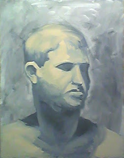


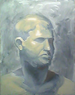
This is the original work - a quick life study in warm and cool. The student used Payne's Grey, Raw Sienna and Titanium White.

WHEN A SHADOW FALLS ON THE LIGHT SIDE IT WILL BE LIGHTER:
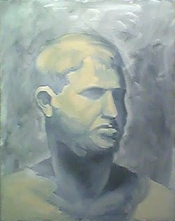


This is a hard one for most people to understand so I'll try to make the steps duck-soup simple.

Each object has a shadow side and a light side. 

So I added a shadow to the shadow (right) side of the forehead where there was none. 

Because the light comes from the upper left, I lightened the dark shadow on the shoulder on the left...because, given the light, I didn't think it could have been a dark "cast" shadow.

IMPORTANT: When a shadow appears on the light side of an object it will appear lighter than any shadow on the shadow side of the face (as illustrated with a heavy hand above).

Accordingly, I lightened the left eyesocket and all down the light (left) side of the face and neck.

IMPORTANT: No shadow ought to dramatically disrupt the flow of light on a lighted plane. Or, the light will illuminate whatever shadow it surrounds.

WHEN LIGHT FALLS ON THE SHADOW SIDE IT WILL BE DARKER THAN ON THE LIGHT SIDE

So keeping this in mind, I darkened both the light that fell on the cheek on the shadow side of the face and the light on the lip as it entered the shadow side of the face.

The value of light and shadow areas are not equal and are determined by where they fall. 

HIGHLIGHTS ARE COOL:
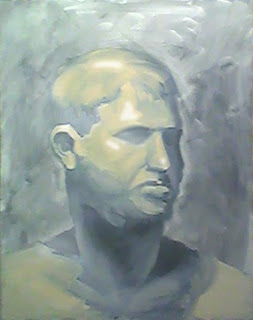


Highlights need to be cool. The term "warm and cool colors" are relative - often determined by what surrounds them.

The general light is always warm and the student got it correct here. However, highlights are always lighter and cooler (as added to the original pix above via Photoshop) and it is the layering of warm and cool that will create form.

IMPORTANT: It may help you to think that a highlight will reflect the white light of the sun.

CAST SHADOWS ARE WARM (you can make them colorful and hot):


Deep shadows (aka, cast shadows) are warm - and if you make them hot - they don't even have to get too dark. I added a little orange into the deep shadows above to illustrate this. 

Warmth can be glazed or painted thickly. Sometime a thin (subtle) glaze of cadmium orange will breathe a little life and fresh air into a dead dark shadow. 

If I were correcting this painting with real paint I would use a glaze of raw sienna to warm up these cast shadows (eyesocket, bottom of nose, and under the chin on the shadow side of the head).

LOSE AND FIND EDGES (shown above)

All the edges on this original work are "found" so I "lost" a couple of edges when I changed the light/shadow ratios to facilitate the integration of background and foreground. Adjusting the  value of either the background or the foreground is a good way to "lose" an edge.

 The student can correct this with a brush with a heckuva lot more finesse and subtlety than I have with my clumsy Photoshopping efforts.

BEFORE AND AFTER COMPARED:
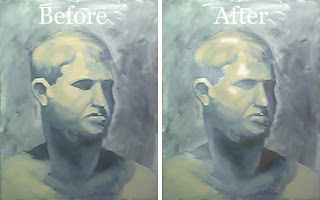


See how much more "sculptural" this painting has become? It suddenly appears as if the drawing has been "corrected" - but it wasn't (you saw exactly what I did, eh?).

Merely following some very basic principals of light and shadow will go a long way to painting more accurately (and certainly more easily).

Painting is Duck Soup Simple when you know how.

"Knowing what you're looking at makes painting so much easier."
Karin Wells

Splendiferous Threads Teach Form #1


Long ago I "discovered" that the weavers of these masterful threads of splendor (Baroque Tapestries) really knew their stuff and layered their colors by temperature in order to create form. 

It is said that learning to paint is merely learning to "see" - better. And I learned a lot by looking at old tapestries.

This is a detail (below) of an old Baroque Tapestry border detail based on Raphael's (really cute) cherubs.


In order to create form, it is necessary to layer paint by its temperature. Please note that the color temperature of paint is relative to what surrounds it.

It is tough to see this in the Old Masters - but if you stand in front of a painting in a museum long enough - and if you know what you're looking for - you can see it.

Funny how that works, eh?

Reproductions of paintings in books makes it hard to see this. It is also hard to see on a computer monitor.

However, I "discovered" that the weavers of those old threads of splendor (Baroque Tapestries) really knew their stuff and layered their colors by temperature in order to create form.

Here's something to help you (hopefully) see better next time you visit the Old Masters in a museum.


Highlights are the lightest color and reflect the "white light" of the sun. Shiny objects have sharp well defined highlights and dull surfaces have soft and often ill-defined highlights.

I usually add a dab of white to the color of light to make a highlight.


General light is warm - relative to the color of the object. We see that sunlight tends to bleach out and warm up a color.

I like a mixture of Winsor Newton's Yellow Ochre Pale + titanium white to add to a color to make a general light.


Halftone is where light and shadow meet. Light can move very quickly into shadow and then the halftone is very small.

Or light can take a long time to turn into shadow and then the halftone is very large.

This very important transition between light and shadow (halftone) defines form and will appear cool between the warm light and warm shadow.


Shadow (no light here) is warm and luminous.


The cast shadow is very warm and deep dark reds often work here when you can get away with it.

For more on this subject, see:


and


Splendiferous Threads Teach Form #2

Long ago I "discovered" that the weavers of these masterful threads of splendor (Baroque Tapestries) really knew their stuff and layered their colors by temperature in order to create form. 

It is said that learning to paint is merely learning to "see" - better. And I learned a lot by looking at old tapestries.

This is so darn important I'm going to repeat myself - but with a different example. If you really "got it" on post #1, you don't need to read/reread this post.


This is a detail of an old Baroque Tapestry based on "The Battle of Granicus" by Charles Le Brun c.1664.

In order to create form, it is necessary to layer paint by its temperature. Please note that the color temperature of paint is relative to what surrounds it. 

It is tough to see this in the Old Masters - but if you stand in front of a painting in a museum long enough - and if you know what you're looking for - you can see it.

Funny how this works, eh?

Reproductions of paintings in books makes it hard to see this. It is also hard to see on a computer monitor.

Here's something to help you (hopefully) see better next time you visit the Old Masters in a museum.


Highlights are the lightest color and reflect the "white light" of the sun. Shiny objects have sharp well defined highlights and dull surfaces have soft and often ill-defined highlights.

I usually add a dab of white to the color of light to make a highlight.


General light is warm - relative to the color of the object. We see that sunlight tends to bleach out and warm up a color.

I like a mixture of Winsor Newton's Yellow Ochre Pale + titanium white to add to a color to make a general light.


Halftone is where light and shadow meet. Light can move very quickly into shadow and then the halftone is very small.

Or light can take a long time to turn into shadow and then the halftone is very large.

This very important transition between light and shadow (halftone) defines form and will appear cool between the warm light and warm shadow.


Shadow (no light here) is warm and luminous.


The cast shadow is very warm and deep dark reds often work here when you can get away with it.

For more on this subject, see:


and


A Quickie Lesson in Layering Warm & Cool Colors to Create Realistic Form

It is OK to paint what you see, but it is much more important to paint what you know. The human eye is not always "sophisticated" or "trained" enough to observe reality and the Old Masters certainly knew this.

Here is a quickie visual lesson in layering warm and cool paint to define realistic looking form. The example with numbers superimposed below is a head painted by Rubens. (Wisecracks about "painting by the numbers" won't be appreciated).

As light strikes a form most intensely at the highlight, it will transition into a deep shadow. As the light flows around the form, warm and cool tones begin to alternate. 


It is important to be able to see and understand this in order to create any form with a paintbrush.

Each band of color temperature helps define form. 

The overlapping of warm and cool color is essential in building realistic-looking form. (The terms "warm" and "cool" color are relative to the specific color used...i.e., warm and cool skin tones)

1. Highlight is cool. The lightest value, cool color paint on an object.

2. Light is warm. The next lightest value, warm color paint - and it continues to get lighter still as it approaches the area of highlight.

3. Halftone (where light and shadow meet) is cool. A mid-value, cooler color paint where light begins to turn into shadow - but can't be defined as either light or shadow.

Halftones can be narrow when light meets shadow quickly as at a hard edge.

Halftones can be wide when light meets shadow slowly as over the surface of a gently curved form.

4. Shadow is warm. A dark value, warm color paint.

5. Deep Shadow (cast shadow at the origin) is hot. Darkest value, hottest color paint.

6. Reflected light within a shadow is as close to pure color as you can make it (see the post just before this one for more detail). The reflected light should match the value of the shadow and it can be either warm or cool in color.

Below is a detail of a face by Rubens. With specific reference to the numbers above, I hope you can see the layering technique I have described. If you can begin to see this, you can begin to paint it.


The above illustration is merely meant to help the beginner "see" and is not meant to be a set of rigid rules. 

Sometimes I think of painting as a bit like learning to ride a bicycle. Some of us don't learn as quickly as others and training wheels come in verrrry handy. Eventually though, those training wheels will get in the way - but in the meantime they are darn useful.

So many begining painters "crash and burn"...sadly, left alone to suffer from an untrained eye. Unless they are taught to "see" they will never learn to paint well.

I feel that any help a beginner can get to produce a good result is valid. With a few successful paintings under a belt, so to speak, a beginner can gain the knowledge and experience that works for them.