Student Critique - Lessons in Light and Shadow


"I always paint what I know and not merely what I see."
Karin Wells

I am so grateful to have permission to use a student work to critique in order to illustrate a couple of the fundamental principals of painting. 

This is NOT a critique of the drawing - that is another subject. But you can see how easily the drawing will be to correct when the principals of light and shadow are correctly applied.

THE ORIGINAL STUDENT WORK:


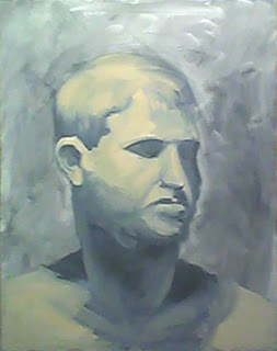
This is the original work - a quick life study in warm and cool. The student used Payne's Grey, Raw Sienna and Titanium White.

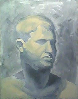
WHEN A SHADOW FALLS ON THE LIGHT SIDE IT WILL BE LIGHTER:


This is a hard one for most people to understand so I'll try to make the steps duck-soup simple.

Each object has a shadow side and a light side. 

So I added a shadow to the shadow (right) side of the forehead where there was none. 

Because the light comes from the upper left, I lightened the dark shadow on the shoulder on the left...because, given the light, I didn't think it could have been a dark "cast" shadow.

IMPORTANT: When a shadow appears on the light side of an object it will appear lighter than any shadow on the shadow side of the face (as illustrated with a heavy hand above).

Accordingly, I lightened the left eyesocket and all down the light (left) side of the face and neck.

IMPORTANT: No shadow ought to dramatically disrupt the flow of light on a lighted plane. Or, the light will illuminate whatever shadow it surrounds.

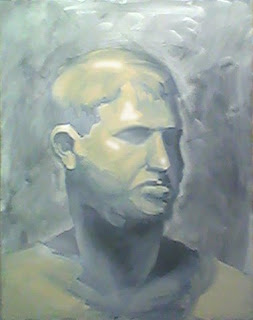
WHEN LIGHT FALLS ON THE SHADOW SIDE IT WILL BE DARKER THAN ON THE LIGHT SIDE

So keeping this in mind, I darkened both the light that fell on the cheek on the shadow side of the face and the light on the lip as it entered the shadow side of the face.

The value of light and shadow areas are not equal and are determined by where they fall. 

HIGHLIGHTS ARE COOL:


Highlights need to be cool. The term "warm and cool colors" are relative - often determined by what surrounds them.

The general light is always warm and the student got it correct here. However, highlights are always lighter and cooler (as added to the original pix above via Photoshop) and it is the layering of warm and cool that will create form.

IMPORTANT: It may help you to think that a highlight will reflect the white light of the sun.

CAST SHADOWS ARE WARM (you can make them colorful and hot):


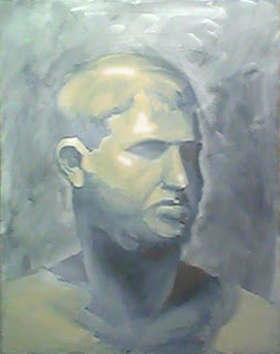
Deep shadows (aka, cast shadows) are warm - and if you make them hot - they don't even have to get too dark. I added a little orange into the deep shadows above to illustrate this. 

Warmth can be glazed or painted thickly. Sometime a thin (subtle) glaze of cadmium orange will breathe a little life and fresh air into a dead dark shadow. 

If I were correcting this painting with real paint I would use a glaze of raw sienna to warm up these cast shadows (eyesocket, bottom of nose, and under the chin on the shadow side of the head).

LOSE AND FIND EDGES (shown above)

All the edges on this original work are "found" so I "lost" a couple of edges when I changed the light/shadow ratios to facilitate the integration of background and foreground. Adjusting the  value of either the background or the foreground is a good way to "lose" an edge.

 The student can correct this with a brush with a heckuva lot more finesse and subtlety than I have with my clumsy Photoshopping efforts.

BEFORE AND AFTER COMPARED:


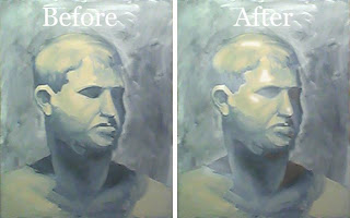
See how much more "sculptural" this painting has become? It suddenly appears as if the drawing has been "corrected" - but it wasn't (you saw exactly what I did, eh?).

Merely following some very basic principals of light and shadow will go a long way to painting more accurately (and certainly more easily).

Painting is Duck Soup Simple when you know how.

"Knowing what you're looking at makes painting so much easier."
Karin Wells

A Painter's Approach to "Blush"


If you are going for a realistic look in portraiture - ignore everything you know about applying makeup!

Beauty tips do NOT apply to the painting of a portrait.


Blush the cheeks with red, but keep it away from the nose and keep it low on the face - right down to the jaw line. 


My apologies to the Mona Lisa for using her face as a color map to show where the red really should go. 


Don't put any red on the forehead or the neck - be mindful of color banding as shown so well in George above.


Add your reds directly to the wet paint on your canvas - don't mix it first on your palette  first.


The nose and nostrils are warm.


And you can add some red on the upper lids of the eyes and in the inner corners and along the top of the lower lid.


You can add red from the lower jaw line right up to (but not beyond) the eyebrows.


Add lots of red to the ears.


You can add even more red to the shadow side of the face.


When you have blended the red in, the effect should be fairly subtle.


You don't want to add so much red that your face looks sunburned. Also, don't cover large unbroken areas in red or else it will look fake. 


You want to leave some areas red-free so there is some variety.


You can do the same thing for the hands and feet that you did for the face. You can use use quite a bit, especially on the soles of the feet, palms of the hands and fingertips. 


Red likes any place on the human body where the bone comes near the surface - elbows, knees, knuckles.


Sometimes it is easy to add more red to the face of a child than an adult.

I use a warm and a cool red: Indian Red and/or Alizarin Crimson Permanent.


Gosh I Wish I'd Said That


Every now and then something strikes me as "just right." I got an email today from Robert Maniscalo that promotes his new book, Point of Art. 

I really liked these particular quotes:

"Whether you are painting realistically or not, it is beneficial to begin to see shapes and patterns abstractly.

The best realists are great abstractionists. We must learn to distill forms down to their essence. 

Representational painting is about values. When you can master increments of value like a musician masters scales, then you can paint anything you see."


Tickling Your Punny Bone


She was only a whisky maker, but he loved her still.


How To Turn An Edge


To make your painting look "real" you have to create the illusion that the edges of objects turn back into space.

Think of a landscape with "blue" mountains in the distance. The further away from the eye an object is, the cooler (bluer) it gets.

It doesn't matter if the object is close and small and not very deep - the principal is the same.


The edges (above) are not turned. I saved them for last so I could show this mini-demo. I usually turn an edge as I paint.

Edges must be "cooled" in order to turn. It is usually so subtle that it isn't easily seen but your brain will suddenly recognize the realistic look of a three-dimensional form. 

But if you don't turn those edges, the object will look like a cutout pasted onto a flat surface...and it won't look like a believable realistic form.


The edge of the sleeve in the photo on the right is not turned yet. 

The left side shows a turned edge. Because it is so darn difficult to photograph and see on this blog, I  had to enhance the process with Photoshop.

You can use several methods to turn an edge. 

Add a thin cool blue glaze...enough to fool the eye but not enough to add color. I've seen Velazquez do this.

OR

When the paint is still wet on the object you're painting, add a dab of ivory black (or blue) to cool the object's edge and it will magically turn back into space.


The edges of all the objects (clothing, folds, hands, legs, hair, etc.) in this painting have been turned. 

It is tough to see here but the effect is almost magical when you're standing in front of the painting.

I really think that the Old Masters are ultimately the BEST teachers of realistic painting. When you know what to look for, you will be able to see it. 

MY BEST ADVICE: Take a trip through any good museum and observe how many different ways the Old Masters used to turn those edges.


Tickling Your Punny Bone

The butcher backed into the meat grinder and got a little behind in his work.


Off (& On) The Walls


Have you ever noticed how many art galleries and museums change wall colors depending on the art that’s on display?


Unless your work is very modern, your paintings are likely to look better displayed on a colored wall too.


However, in the studio where I work, I find it useful to have walls painted a neutral color. I like to see a color be about the value of a brown paper bag (I'm not kidding).

The color on my studio wall will adversely influence my color choices while painting so I like to stick to dull neutral earth colors.


This is me and I hung an old faded oriental carpet behind my easel. You can see how the white on the edge of my canvas shows (by comparison) how dark my studio wall really is.

I cannot paint when the color "white" is in my field of vision - it completely throws off my "eye" as all other colors will look much too dark.

The Old Masters used to tone their canvas (imprimatura) so they wouldn't have to look at "white."


Many art museums have darkish colored walls as it shows off the paintings very well. The right color background will make the art come to life.


Stark white walls can make an Old Master style painting look much too dark and dead.


The varieties of wall colors that look great are endless.


It is very effective to have something in the painting both darker and lighter in value than the value of the walls surrounding it.


Also notice that the museum paintings here are hung relatively low on the wall so that the viewer's eye level falls approximately mid-painting.

Tickling Your Punny Bone


I thought I saw an eye doctor on an Alaskan island, but it turned out to be an optical Aleutian. 


Dressing for (Art) Success - Really!


What is it about a beret and black clothing that always "says" artist?


Even in cartoons for Pete's sake!


It took me a while to figure this one out but here's how it happened.


Even the fake artist like this can look "real" if he dresses the part - but I'll wager he doesn't know why.

I spend a LOT of time at my easel and don't get a lot of exercise...like how much of an effort is it to move my hand and eye all day? It isn't as if I work up a sweat painting.


Like a lot of the Old Masters, I live in a cold northern climate. If I wear a hat, it really keeps me warm.  I keep one in the studio. It has no brim because I don't want a shadow across my eyes. Hence I usually wear a  wool beret (and woolly sox) most mornings in the wintertime until the studio warms up.


Then there was the clothing problem. I used to just put on any old clothes that I didn't care much about if I spilled some paint.

HA! This was a short lived practice and here's why:


I'd work all day and sometimes I'd find it easy to get an accurate skin tone - sometimes not. I couldn't figure it out.


I eventually began to notice that if I wore a red shirt, for example, I would put too much green in the face in order to compensate.

A green shirt, would, of course reflect into the wet paint and wrongly tell my eye to add too much red paint.


You get the idea? Colored clothing will reflect on your canvas and will prevent you from seeing and painting colors accurately.


Now I wear neutral clothing - mostly black or dark brown.

I look "just like an artist" these days when I paint.


And then there's the WALL COLOR - it has to be something neutral too. White doesn't belong on a studio wall unless the art is totally "modern"(you can quote me on this.) Just look at the studio walls in the self-portraits of the Old Masters as they paint - the decor is pretty dull - just like their clothes.

See comments below.