Painting Annie - "The Secret Pancake Method" Explained


Sometimes I start a portrait "as flat as a pancake." Here's a peek into my process.


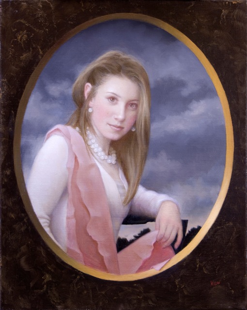
This is my finished portrait of Annie (above). It is 16" x 20" - oil on linen and I'll bet that you cannot see the "pancake here."

One day I happened to come across a poster of Michaelangelo's "Manchester Madonna" (below) and the light bulb came on :


And suddenly, the "Pancake Method" began to make sense. Thanks Michaelangelo.


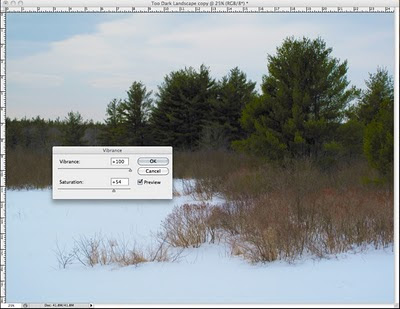
This is the "pancake" that is underneath my painting of Annie. I wanted to establish and fix the composition and account for all of the colors (red, yellow, blue, black and white). Needless to say I did a drawing before I started the "pancake."

Flat Color Notes:

"Black" is a color I mix from burnt umber + prussian blue.

The "blue" sky is a mixture of ivory black + titanium white.

The hair, skin and white sweater are a mixture of raw umber + white (all the same value in this portrait). Had Annie been a woman of color, I would have used the same colors - but made the skin and hair a darker value (i.e., less white).

The "red" (I'm going for pink on the scarf) is burnt sienna + a touch of alizarin crimson permanent + white (with enough raw umber to dull it all down).

"Yellow" is a a mixture of yellow ochre + raw umber.

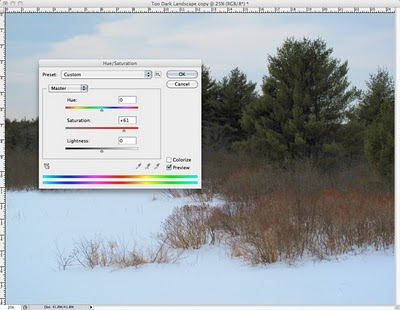
I often use these basic earth colors to establish nearly all of my color in the first layers....no matter whose portrait it is.

Only if you are working on an acrylic primed canvas, you have the option to use "Liquitex's Opaque Acrylic Color Matt Basics." The oil paint must "grab" the acrylic layer beneath or the painting will not be archival. Sometimes I lightly sand the dry acrylic surface to help the oil paint "grab." Even in Acrylic paint, I stick to an earth palette.

However, I mixed oil paint for this painting and in places, it took a couple of layers to cover to make it as "flat as a pancake" - as shown above.


After the "pancake" stage, I begin work on a dry surface.

If the surface is acrylic, I will cover it with Liquin and let that dry before I begin with oil (to ensure a good bond).

No matter how I paint, I begin with the background.

I glazed over the "brown frame" with raw umber and then used a paper towel crumpled up and dipped into yellowish-brown paint. Then I "fuss around" with a brush for a minute or two and this part is done.

I match the paint in the sky and then paint clouds into the wet surface. (I use a touch of raw umber + white to make those clouds.)

Then I blend the gold into light and shadow on the oval and begin to build some light on the shoulder and scarf.


I draw on the dry surface with chalk and mix thick paint to establish light and shadow and then begin to define the shadow patterns....an important element of composition.

Although my finished work doesn't look like I've piled on the paint - I do.

I learned to "always paint with a quiet brush." If your brush makes noise - you haven't got enough paint on it. Seriously.


Here's a detail above before I begin to blend light into shadow. I paint right over my "chalk" guidelines. I used a soft white pastel and it just blends into the wet paint.


This is light and shadow blended. Where light and shadow meet is called the halftone. The light can turn quickly or slowly as it moves into shadow to define the form.

I pay a lot of attention to the halftone and try to keep my shadows light and luminous (even though it never looks this way in a photograph).

About Skys:

In general, the sky is darker and cooler at the top and lighter and warmer near the horizon. Prove it to yourself - go outside and look up. You can exaggerate this fact in a painting to "fool the eye" make it look more "real."

Clouds are larger near the top (closer) and get smaller as they approach the horizon (farther away).


After light and shadow are blended, I use chalk on paper under an acetate drawing to transfer the features. Then I "draw" them in using raw umber and Liquin.

Features need to be accurate at this stage (in size, placement & shape) but it isn't necessarily a likeness - yet (above).


After the initial raw umber "draw in" of features, I allow the surface to dry and then glaze raw umber over all. This will both unify and "warm up" the surface.

When this is dry, I continue drawing with raw umber on my brush until I get a likeness - or close to it (above). Note that raw umber is a glaze color and must never be applied thickly.


Yikes! I looks like I wrecked it - but I haven't. Trust me.

Beginning on a dry surface, I scumble (explained here) the skin color (raw umber + raw sienna + white) and glaze the hair. Into the wet glaze on the hair I begin to build light.

Note that I can see through this scumble layer so I haven't "lost" anything despite the "shock" of the way it looks at this stage.

NOTE: Building Light with Karin's Universal Color of Light:

Winsor Newton's Yellow Ochre Pale + white. If it looks "chalky" I add more yellow. If it looks too yellow - I add more white. I do not know if this "light" works with other palettes - but it sure works with my palette.


After the scumble is dry - I can still see the raw umber drawing underneath - so I "draw in" another layer - still aiming for a likeness. I work scumbles and drawing in layers...until it "looks right."

Note that when the paint is wet I work in my color banding.


The portrait needs some pearls but, per usual, I painted what was underneath first. (If you want to lose your mind - try painting the neck around pearls - HA).

In order to get the pearls round and uniform - I used one of those plastic round brush tops and dipped it in a mixture of raw umber and white and "stamped it on" (above).

Note: I could have used an eraser on a pencil, a soda straw, etc.


I finish the pearls (and turn the edge on each one). Then I build light on the scarf while the pearls dry.

When ALL is dry I quickly turn any edges I didn't turn earlier....to hide the "pancake" so Annie will not look like a cardboard cut out.

There are several ways to turn an edge so an object will look three dimensional:

First, when the paint is wet, the edge can be cooled with a dab of ivory black on the edge and blended in so as not to show.

When the object and the background are both wet, the paint can be slightly blended together if the effect is to "cool" the edbe of the object in front.

If you're in a hurry, you can take a light glaze of blue (I use French Ultramarine) to cool the edge. You have done it right if the blue doesn't show - but the edge "magically" turns back into space.

NOTE:: It is important to "lose and find edges."

All the edges on "a pancake" are "found" so it is nessary to "lose" some edges to make the painting "hang together."

I changed the light/shadow ratios to facilitate the integration of background and foreground. Adjusting the value of either the background or the foreground is a good way to "lose" an edge.


Here is Annie again (with a "pancake" hidden beneath it all).

And here is a peek underneath yet another (pancake) portrait I painted:


Above is the "flat as a pancake" beginning. I used acrylic on this canvas and the "pancake layer" you see is only partially done.

When a portrait is large and complicated, I like to use acrylic because I want the option to paint light over dark. This works because the acrylic paint I use is completely opaque. Oil isn't opaque and doesn't work that way.

Note:
You can paint acrylic over acrylic - and oil over acrylic - but you can never ever ever paint acrylic over oil paint. Don't even think about it....unless you like paintings that self-destruct.


Here is the same portrait finished. The "pancake" first layer doesn't show does it?
I kept the colors in the same family - but changed them all with glazes and scumbles to look more "Old Masterish."

So what makes me decide to use the "Pancake Method" in a portrait? When I am looking through my reference photos and composing the painting, I am only thinking of the final result.

Lately I am more and more beginning with the "pancake." It is important to establish a strong abstract design first and foremost. It is all to easy for me to get lost in the "reality" of a painting and fail to establish a strong composition.

The pancake is devoid of reality and forces me to deal with negative and positive spaces and the overall placement of areas of color. I can add and subtract space at this stage and force "reality" to bend with me to build a more solid painting.

For example, in Annie's portrait above, the hair in my reference photo fell straight down on both sides. In the pancake, I gave it a more "interesting" shape to interact with the background for the sake of the composition.

How to Fix It: When You Saw It - But Your Camera Didn't Cooperate


Last year I went looking for a winter landscape to paint. This is what I saw near my house:


The scene had some potential: interesting design elements and the required colors for a good painting: red, yellow, blue, black and white....so what could go wrong? Ha!

And of course, this is what my camera recorded - it could have won "The Blah Award" (and I have more than a few of these).


So I fixed it in Photoshop to make it into a more useful photo reference and this is how I did it:


Select: Image - Adjustmets - Levels.


In Levels, grab the right hand triangle and slide it to the left so it just touches the black line on the far right side of the curve.

Then grab the middle triangle and move it slightly to the left until it "looks okay."


In Adobe Photoshop CS4 I do this above:
Image - Adjustments - Vibrance (increase)


With earlier versions of Photoshop, you can do this:
Image - Adjustments - Hue/Saturation (increase saturation as shown above)


In the same way, Photoshop works for problem portraits too:


This is my old friend, Artist John Garcia. He died and all we have is a crummy snapshot that doesn't do hm justice (above).


With the help of Photoshop, however, his family and friends can better enjoy this picture of John's warm smile and friendly face.

Moral:

"Never give up on a bad photo. . . sooner or later, technology will catch up."

Robert Shetterly Figures it Out Years Before I Do


A year ago, I decided to paint "Granny D" because she inspired me. At the age of 90, she put on her sneakers and walked across the country to tell people about campaign finance reform being necessary to keep our democracy intact.

I soon realized that it feels good to paint "people who tell the truth" and that's when I "discovered" that Robert Shetterly was way ahead of me!

Nine years ago, this man began painting a series of portraits. He found great Americans who spoke the truth and combined their images with their words as a way of to channel his anger and grief at our current political situation.


Here are some of Shetterly's words that got my attention:

"We see hegemony and greed thinly veiled behind patriotism and security. We get preemptive war instead of pre-emptive planning for a sustainable future.

The greatness of our country is being tested and will be measured not by its military might but by its restraint, compassion, and wisdom. De Toqueville said, “America is great because it is good. When it ceases to be good, it will cease to be great.”

A democracy, whose leaders and media do not try to tell the people the truth, is a democracy in name only. If the consent of voters is gained through fear and lies, America is neither good nor great. Nor is it America."

Important Note From Karin:
I have seen these portraits in person and regret that I do not have very good pictures to post here. I assure you that they are quite beautiful and inspiring.


Doris Haddock (“Granny D”), Activist 1910-2010 by Robert Shetterly
“Just as an unbalanced mind can accumulate stresses that can grow and take on a life of their own, so little decisions of our modern life can accumulate to the point where our society finds itself bombing other people for their oil, or supporting dictators who torture whole populations—all so that our unbalanced interests might be served.”


To give as presents (so far), I have bought four copies of the book: "Americans Who Tell the Truth, Portraits by Robert Shetterly."

The following is an Essay for YES! Magazine (in blue below) by Robert Shetterly

“The most alarming sign of our society now is that our leaders have the courage to sacrifice the lives of young people in war but have not the courage to tell us that we must be less greedy and less wasteful.” - Wendell Berry

"I did not want to paint these portraits. Over 25 years, I
had built up a career as a surrealist painter—enough of a career to pay my bills, work full time, and, it seemed to me, fulfill my societal obligations as an artist. I had never painted a portrait.

Then September 11, 2001… then a war launched not against the perpetrators of the crime but against a country where they had some training bases… then the
blatantly false reasons promoted by our government for the preemptive war on Iraq. My sense of obligation as an artist changed.

At first, what I wanted most was to express my grief, cynicism, and shame. But I soon realized that agonizing over my shame for this country would lead me nowhere positive. Why, I wondered, don’t I surround myself with people who make me feel proud, people who have insisted that this country live up to its own professed ideals about inali
enable rights, equality, and justice? Why don’t I invoke their spirits by painting their portraits?

I did not want to support the myth of American exceptionalism, the stories of power and domination that we tell to set ourselves apart from th
e rest of humankind, but to tell the story of this country’s long and courageous struggle for justice.

Our revolution did not end in 1787. At the signing of the Constitution, we did not free the slaves, give political rights to freed African Americans, Native Americans, women, the disabled, or poor whites. Our revolution was just beginning.

Just as fear is infectious, so is courage.

I decided to portray real, ordinary people who continued that revolution by fighting to extend rights to everyone, whose persistence and courage changed their own lives and provided role models for all of us.


William Sloane Coffin, Clergyman, Social Activist 1924-2006
“The war against Iraq is as disastrous as it is unnecessary; perhaps in terms of its wisdom, purpose and motives, the worst war in American history…. Our military men and women…were not called to defend America but rather to attack Iraq. They were not called to die for, but rather to kill for, their country. What more unpatriotic thing could we have asked of our sons and daughters…?”

“Without courage,” William Sloane Coffin said, “there are no other virtues.” Any person acting with courage for justice, becomes a teacher, becomes a light in the darkness, encourages all of us to become our own lights. Just as fear is infectious, so is courage.


Sojourner Truth, Abolitionist, evangelist, and feminist, 1797?—1883
"Now I hears talkin about de Constitution and de rights of man. I comes up and I takes hold of dis Constitution. It looks mighty big, and I feels for my rights, but der aint any dare. Den I says, God, what ails dis Constitution? He says to me, “Sojourner, dere is a little weasel in it.”

Think of Sojourner Truth, the illiterate ex-slave, who became one of the greatest leaders for women’s rights and the abolition of slavery. Today we remember and admire her, not her rich white owner—not his social status, money, or privilege, but her courage.


Ann Wright, Army Colonel, Foreign Diplomat, Anti-war Activist, Peace Advocate, 1946 -
"I have served my country for almost thirty years in some of the most isolated and dangerous parts of the world. I want to continue to serve America. However, I do not believe in the policies of this Administration and cannot --- morally and professionally --- defend or implement them. It is with heavy heart that I must end my service to America and therefore resign."

Colonel Ann Wright’s resignation from the diplomatic corps in protest of the illegal invasion of Iraq was not intended to make herself a celebrity. She resigned to better defend the Constitution that she had sworn to protect.


Rachel Carson,
Biologist, Writer, Ecologist, 1907-1964
“The ‘control of nature’ is a phrase conceived in arrogance, born of the Neanderthal age of biology and the convenience of man.”

Think of Rachel Carson, dying with cancer, refusing to be intimidated by the chemical companies who were using all of their power to humiliate and discredit her when she exposed how their chemicals were poisoning the natural world. What a debt we owe to her courage!

At the same moment that I got the idea to paint the portraits, I knew th
at the words of the subjects had to be on their portraits. The statements being made about various forms of justice had to be literally spelled out. These aren’t just people in paintings looking at you. They are people imploring you to listen and act.

When I began painting, I didn’t expect to share the portraits—I imagined a stack in my attic that would make me feel better. I set a goal of 50 portraits, but never expected to reach it. Now there are 150 portraits. They travel to schools, colleges, libraries, museums, and community centers all over th
e country.

I titled the collection “Americans Who Tell the Truth” to recognize that telling the truth about our nation and its needs is not a small act, but one of great bravery.


Marian Wright Edelman, Children’s Advocate 1939-
“What’s wrong with our children? Adults telling children to be honest while lying and cheating. Adults telling children to not be violent while marketing and glorifying violence… I believe that adult hypocrisy is the biggest problem children face in America.”

Marion Wright Edelman, head of the Children’s Defense Fund, once said, “What’s wrong with our children? Adults telling children to be honest while lying and cheating. Adults telling children not to be violent while marketing and glorifying violence.

I believe adult hypocrisy is the biggest problem children face in America." I have repeated that quote to students of all ages all over this country and have yet to find a student who disagreed with it.

The portraits are an affirmation that only through persistent courage and dedicated citizenship can we maintain our ideals.

I would not classify my decision to give up my former artistic career to paint these portraits as an act of courage, but I would call it an act of defiance, of resistance, of refusal to accept a lie as a patriotic reason for war, of refusal to accept that a country that allows a presidential election to be stolen is the greatest democracy on earth.

The portraits are an affirmation that only through persistent courage and dedicated citizenship can we maintain our ideals. If we want to define the destiny of this country as a movement toward enlightenment and justice, we have to accept the responsibility of making that happen."

Here is another artist, Tilly Woodward, that Robert painted:


Tilly Woodward, Artist, Professor, 1957–

"What moves me? Is it mission? It's permission. I start by giving myself permission. But what I really want, ultimately, is to give other people permission to value themselves. ... when you confirm goodness you are taking an important step. When we confirm people's goodness over and over, we allow them to be that way."

"Tilly Woodward is an artist whose creations, inspired by global social problems, offer both dialogue and healing, and show that tragedies and triumphs of all kinds can happen to anyone, and affect everyone.

In school, Tilly Woodward's work had been very personal. That changed when she saw photographs of children, killed in a political battle, laid out in rows for burial. She writes, “It was a pivotal moment for me in which I started to become aware of a world larger than myself….” This discovery led to “Children as Victims,” a series of large pastel drawings taken from the disturbing photographs.

Her change in art direction led to the I-70 Project in 1985, an installation of ten painted billboards which lined route I-70 from St. Louis to Kansas City. The billboards depicted events of worldwide historical importance, from the Holocaust to certain boxing matches. By placing the images in the Midwest, far away in time and distance from where the events took place, Woodward asked people to consider them as ethical dilemmas that concern everyone.

After moving to Pella, Iowa in 1990, Woodward’s art widened in scope and intention. She felt that “It no longer seemed enough to merely point out a problem without offering some step toward a positive solution.” In “Portraits of Dubuque,” a response to racism, she drew portraits of diverse individuals, nominated for having performed a good deed or act of kindness.

Woodward hoped the project would “help people recognize each other as individuals and better recognize human kindness regardless of race, gender, age, faith, or economic background.” Her “AIDS Portrait Project,” combining portraits with words, gave a voice to Iowans living with AIDS. In her community, Woodward had heard it said, “AIDS couldn’t happen here because we live in a small, Christian town. I also heard it said that AIDS was a judgment from God, and I wanted my children and others to learn that AIDS can happen anywhere, and that all people deserve compassion and dignity in sickness and death.”

An ongoing project from 2004 is the Ribbon Monument. In its initial installation, victims of rape and sexual abuse were invited to write their stories on ribbons that were posted on thin metal poles. As with Buddhist prayer flags and Tibetan Thankas, when the ribbons are moved by wind or a passerby, the story is sent out into the world.

Now, the installation changes depending on the site where it is shown. With this project, Woodward hopes to end the silent suffering of these victims, so often doubted, even blamed for what happened to them. As Woodward writes, “This way the stories are told, they are visible, and they are moved as prayers for healing by the wind.”

So, the next thing on my list is to ask Robert Shetterly if I could paint him - he is the artist who saved his own sanity (and maybe mine) with his awesome, big, wonderful, positive portrait project.

Thanks Robert - you make my heart sing!

Love,
Karin