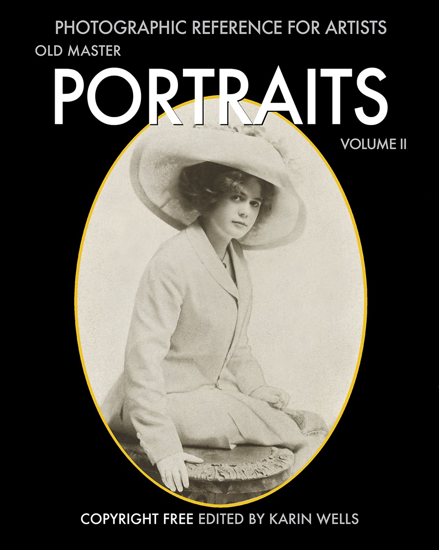
...but those clothes, drapes and props surely do make the portrait.
THIS is what photographic reference photos for a painting should look like!
If you're serious about improving your photographic skills in order to paint better portraits, find a copy of this book and take notes.
Seidner has taken photographs that look like Old Master Paintings with a single light source.
Yum.
Sadly, many painted portraits nowadays look like "snapshots" taken with a flash bulb.
Yuck.
This woman's skirt is just a drape. She has fake doll's hair braids pinned to her hair.
This stunning "outfit" appears to be a blanket and the "hat" is feathers.
Drapery, ribbon, a fake flower and a lace tablecloth....I imagine that lots of things are "hidden" - like rubberbands, safety pins, clips, scotch tape, etc.
Material around the hair - a dress....on backwards?
Here is a vest with gauze tucked into it and arranged for the photo.
Jewelry in the hair, one glove, a pin, tablecloth, scarf. It is the arrangement of pose, color, texture, value, props and idealized lighting.
Get the idea?
Use your imagination and get creative with drapes, props and scraps in a photo shoot! For me, it is just a big girl's version of "playing dress-ups."


No comments:
Post a Comment