Showing posts with label Art Supplies I Love to Use. Show all posts

Here's One Way to Stop that Dratted Trampoline Effect

Where I live, I need to keep an eye on temperature and humidity changes. Linen canvas will get very baggy and saggy in the dry wintertime.


A baggy canvas causes the "trampoline effect" - a pronounced elasticity in the center which can drive you nuts when you're painting.

In order to create a stable substrate, I used to put cardboard behind my canvas when I painted. And sometimes it sorta worked.

I even had a 24" stretcher* snap when a linen canvas suddenly tightened up in humid weather. Of course it wrecked the painting. And believe me, re-stretching a painting is no picnic.


The aren't cheap. But if you sell your work, it must be archival. Since I began using Art-Boards, it has solved a thorny long-term problem with those large linen stretched canvases.

The linen is mounted with a reversible archival conservator's adhesive that creates a barrier between the panel and the canvas. This means that a painting can be removed from the canvas panel at any time in the future.

The panels I like have an untempered solid core construction with a solid surface of oil primed #13 Claessens Belgium linen.


This panel is 3/8" thick. It also comes with acrylic primed cotton canvas.

These panels have recessed hanging slots and that makes it easy to hang a wet painting on my studio wall to dry.


Custom size linen panels can be ordered to any exact size and made as large as 54" x 120".
They can can be made cradled or uncradled.

They also attach a high quality watercolor paper to their boards.

* Because of that (lightweight) stretcher accident, I only use heavy-duty stretchers for any painting 20" x 24" and larger.

Is Your Palette Right Side Up?

It makes me nuts. (And some days it doesn't take much.)


Upside down palettes.


Here's an upside down palette from a stock photo house. This silly palette is guaranteed to hurt your thumb and get paint all over your hands and clothing.

And besides that's an awful lot of paint laid out on such a small palette, isn't it?


I took this picture of the upside down palette above in the studio in the Rembrandt House Museum in Amsterdam.


The great artist's house and studio are loving and meticulously recreated....but it appears that somebody neglected to consult a real painter before setting up this particular display.


I've seen people who have painted with upside down palettes for years. And that can cause some serious thumb-pain.


Here's how it looks when a right handed artist is holding his palette correctly in his left hand - right side up.


Michael Balsley at Turtlewood (business card above) made my favorite large (counter weighted) studio palette.

A comfy palette can be tough to find and Turtlewood makes a large variety of the best. I can paint all day and my hand won't hurt.


If the artist is right handed (palette for holding in in left hand shown above), he or she will hold the palette, brushes, rag and mahl stick in the left hand and paint with the right hand.

There are also left-handed palettes and flipping a right handed palette over doesn't work.


Palettes come in all shapes and sizes. Note that the thumbhole is cut at a slant for comfort when the above palette is being held in the left hand.


Here it is again: the above pix shows two rectangular right side up palettes that are to be used by a right-handed person who holds a palette in the left hand. The thumb holes are always cut at a slant for comfort.

Also note: some artists like to make their own palettes. Nice idea and I don't discourage it. But make sure that if that palette is to be held, make it as light weight as possible or a fun day of painting could necessitate ice packs applied to the thumb by the end of the day.

So now you know that it matters which side of your palette you put the paint on. If you forget, your thumb will hurt, you'll get paint on yourself and it will be generally uncomfortable.

No more excuses.

Some Lighting Q and A


Vanessa wrote and asked me some questions about the lighting equipment I use for making photographic reference material for a painting. (Her Q's in grey and her original post here). 

I thought that a public answer was a good way to clarify and expand some more information with all of you.

Vanessa: I need one light source strong enough for head and shoulder that can also softly fade down a full-length dress should I need it to.


Yes, I think that a single source of light the best way to photograph a subject for a reference as in the photos above and below. Whether it is a full figure or just a head, the light needs to flow from top to bottom.


Vanessa: I have been looking at a cool florescent daylight and stand with 4 150, or 250watt bulbs - it has a 44 x44 inch soft box. 


Some of these light can be off or on. Britek Pro 5000 produce these and sell them on www.lincoinc168.com (as in above photo).

I have a soft box and the lighting is good. However I quit using it because it doesn’t work well when I photograph children who seldom sit still (or adults who fidget).


Right now I’m shooting with a Nikon Speed light which acts like a strobe in that it freezes action, allows for a lower ASA/ISO (film speed) and a sharp focus.


I prefer a Nikon wireless speedlight commander SU-800 (above) which clicks into my camera and automatically controls the speedlight's flash unit.

I shoot into or through a white umbrella which diffuses the light.


For a small subject – like my Day Lily Still Life above – I sometimes use a hardware store clip-on light holder with a florescent bulb. This makes it easier to adjust, see and compose shadows as important design elements.

Really fancy complicated equipment can be overkill. My best advice is get clear about what in particular  you really need and go for the easiest and cheapest way to make that happen.

Vanessa: Firstly, do you like florescent for portrait photos?

Yes, fluorescent light is more diffused and thus creates a softer shadow. 

I find that my digital camera makes adjusting color a lot less fussy than it was when I was using my old film camera.

Note: I paint using overhead color-balanced fluorescent lighting so my hand does not cast a shadow on my painting surface.

Vanessa: Secondly, in your use of florescent would this light source be powerful enough - as it is not a strobe – what you see is what you get.

Yes, I have used florescent lighting for a figure - but the person must sit still. I was getting way too many blurry shots. But on the other hand, it is easier to see and setup compositional shadow elements when the light source is steady.

But because I now use a speedlight, I make a few test shots in order to properly position my light. When I shoot in my studio, I have a general idea of where the light work best as I have done it so many times.


On location shooting, I often test the lighting with a model before the scheduled shoot. As in the above photo, you can see that there are many ways to light a subject and all of them are probably "correct."

However, as a rule of thumb, it is probably a good idea to have the light positioned on the upper left side of the model - it usually works best there and is a good starting point.

Walk around a museum. Look at the lighting the Old Masters used. You can learn a lot from that.

Also, please note that I use a neutral background drape to shoot my subjects.

When I need a specific background, I shoot that separately and paint it in behind the subject. Getting the background and the foreground “right” is too difficult for one shot - at least for me.


I photographed the model above in my studio using my speedlight. I took many photos of the  background separately and combined some of the elements in order to portray the "character and feeling" of the location.

Vanessa: Thirdly, I would think it would be easier to concentrate on composition, expression, if one is not messing with lighting connections and strobe. Would you agree?

Yes definitely. Once you figure out how to use your equipment, you can easily set it up and use it without much of a fuss. But of course there is a learning curve with all new equipment.

Vanessa: Would you advice that at 30 lbs it might be too heavy for taking on location?

Basically I'm lazy. I like my equipment to be small and lightweight (think airline travel nowadays). My Speedlight and Commander are small enough to fit in my camera case. 


My light stand (model above) folds up along with the small size umbrella and will easily fit into my suitcase.

If I need to bounce light into a shadow area I can use any white object like a piece of paper, poster board, white sheet, etc.

Because I shoot in ambient light (as opposed to a darkened room) I usually don’t need to do this and my speedlight will give me the compositional shadows I need.

I just remember to take a few test shots, download them to a computer and take a peek to see what is happening with my shadows. 

Vanessa: Still lapping up your teaching and loving it.

Thanks, I hope it all helps.

The following pictures are examples of lighting that I like. I include them because it is easy to see the simplicity of it all on a monotone statue.


Don't forget that interesting clothing makes for an interesting painting.


I always try to aim the strongest light on the forehead and let it gently wash down the figure.


With a film camera I had trouble shooting a full figure because I needed to back up away from the model in order to lessen the lens distortion.

With my digital camera I can stand much closer to the model and don't need as large a space to shoot in.


Remember, in general,your light ought to be placed so that it falls strongly on the forehead of the subject being photographed.


You can see that Rubens painted the strongest thickest light on his daughter Clara's forehead.

How I Manage Time - Sometimes


Sometimes I get really really "stuck."

I've been working on a portrait and am not quite sure that I am ready to pick up my brush and find that "elusive" likeness today.

So I switch gears - it's almost like a mini-vacation.

I usually have a stack of unfinished landscape "sketches" laying around the studio - just waiting for me to "pull it all together." Today is cold and snowy and I originally made this oil sketch on a delightfully warm day. When this happens in hot weather, I tend to grab a Fall or Winter scene - go figure.

This is why you're seeing me post landscapes just now:


Ferry Beach, Maine
12" x 16" Oil on Canvas


So I finished this little beach scene I began 2+ years ago and framed it. I like a wide gold, old-fashioned frame for most of my works...they work for me.

"It is never too late to do what you might have done."
(My version of a quote from George Elliot)

A note about my frames:

Since I tend to buy or stretch my canvasses to standard sizes, I find that I can use ready-made frames. I have had good luck with JFM Frames.

A Common Studio Frustration


So how do I keep lint, dust, dirt and cat hair out of my paint?


Easy.


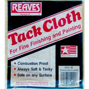
I start with a tack cloth - any brand will do. You get them from your local hardware or paint store.


Out of its package, my tack cloth looks like this (above).

The tack Cloth (sometimes called a Tack Rag) is a (cheap) reusable cloth impregnated with beeswax and it gobbles up dust. You wipe the dry surface of your canvas and your palette before you begin to paint.

You can also wipe down your easel (especially the tray in front).

Keep it fresh between uses in a zip-loc plastic baggie.


You can skip my Stress Reduction Kit above and buy some Shop Towels instead.


I usually buy them by the case at an auto supply store or the car section in a large store (i.e., WalMart). Lint free paper towels also come in a large box but I prefer the rolls as they are easier to store.


Out of the package, a Shop Towel roll looks like this. It is an ugly bright blue but is totally lint free. Always use them to wipe your brushes.

Using ordinary paper towels, you will eventually cause a significant buildup of lint in your paint.


Still frustrated?

Also try this:

1. ALWAYS hang your wet paintings vertically on a wall to dry.

2. Do NOT lay a wet painting flat on a surface (like a tabletop) to collect dust as it dries. 

3. Do not rest a wet painting on the floor.

4. Damp mop your studio floor (or vacuum) as often as necessary to pick up dust.

5. Use an air cleaner - the "Ion" type is best.

Do what you can. It all helps. 

And know that dirt and other things that don't belong in paint was a common problem for the Old Masters too. 


Go to any large museum and find some of those gigantic epic paintings and take a close look at the surface of the paint. 

I remember seeing (at the Musee du Louvre shown above) all kinds of nasty things (like remains of bugs, fingerprints, dog hair) that embedded themselves in thick wet (probably slow-drying)  paint centuries ago. 

If You Need a Precise Chalk Line


I often use non-traditional - oddball - art supplies in the studio.

I found this is a handy little item in a fabric store. It makes a very thin chalk line. The set comes with an assortment of chalks (white plus colors). A mechanical cartridge holder and sharpener are provided.


I often draw on my (matte finish) reference photos to change, add or emphasize a shape.

Sometimes, when my canvas is dry, I'll draw directly on the surface as a painting guide for the next layer (i.e.,  determining stripes or check patterns on cloth).

I usually use a soft pastel for this, but sometimes I prefer a fine point for making a precise line.


Shown above is the Dritz Chalk Cartridge Set (for quilters). But there are other brands available.

Excess chalk can be removed with a wet cloth, a kneeded rubber eraser or you can simply let it "melt" into the paint.

I have also used a standard chalk pencil, but it is a harder chalk and can scratch.


And while you're in a fabric store, consider getting a tape measure. Mine hangs near my easel and I use it more often than a ruler or yardstick.