Showing posts with label How to manipulate a reference photo. Show all posts

How to Fix It: When You Saw It - But Your Camera Didn't Cooperate


Last year I went looking for a winter landscape to paint. This is what I saw near my house:


The scene had some potential: interesting design elements and the required colors for a good painting: red, yellow, blue, black and white....so what could go wrong? Ha!

And of course, this is what my camera recorded - it could have won "The Blah Award" (and I have more than a few of these).


So I fixed it in Photoshop to make it into a more useful photo reference and this is how I did it:


Select: Image - Adjustmets - Levels.


In Levels, grab the right hand triangle and slide it to the left so it just touches the black line on the far right side of the curve.

Then grab the middle triangle and move it slightly to the left until it "looks okay."


In Adobe Photoshop CS4 I do this above:
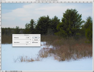
Image - Adjustments - Vibrance (increase)


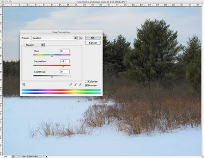
With earlier versions of Photoshop, you can do this:
Image - Adjustments - Hue/Saturation (increase saturation as shown above)


In the same way, Photoshop works for problem portraits too:


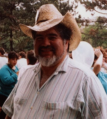
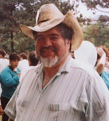
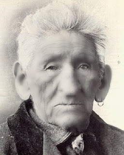
This is my old friend, Artist John Garcia. He died and all we have is a crummy snapshot that doesn't do hm justice (above).


With the help of Photoshop, however, his family and friends can better enjoy this picture of John's warm smile and friendly face.

Moral:

"Never give up on a bad photo. . . sooner or later, technology will catch up."

The iPad Saves My Sanity!


If you have read much of this blog, you will have noticed that I dearly love gadgets.

The iPad is a little pricey so it took me a while to "talk myself" into getting one. However, had known how much it would help me in painting a portrait - I would have done it much sooner!


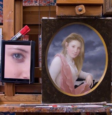
You're looking at the cheapest model iPad with the generic black case sold in the Apple Store. I applied a clear plastic to the surface to protect the screen.

I clipped it to my easel with an ordinary hardware store Electrician's Clamp and a rubber band holds the cover back.

The iPad screen has a very high resolution and I can - with a touch of a finger - enlarge and move a reference picture around very easily. I can paint 10+ hours without having to recharge this device. (I can also listen to music or audiobooks as I work).

The advantage of the iPod screen is that I can now see a variation of subtle tone - more than in any photograph I could ever print out.


This gadget is an ideal way to display reference photographs - and my portfolio.

It is is amazing to me how many of us artists have really poor vision. This gadget allows me to blow up any feature and actually SEE the structure.

I can paint faster, more easily and more accurately now - my only regret is that I didn't get an iPad much sooner.

Cheaper Than Plastic Surgery


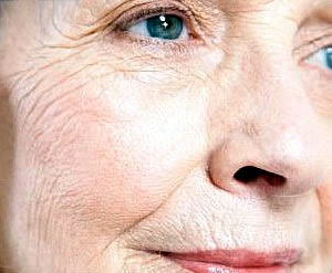
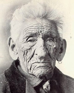
Photographs tend to clump values at both ends of the scale and wrinkles stand out and appear exaggerated.


When you're painting someone with wrinkles - know that they always look worse in a photograph than in person.


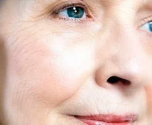
This is the same photo after I took out some of those dratted wrinkles via Photoshop. Per usual, I've exaggerated to make the point.

So here are two examples and you can see how to tone down those wrinkles step by step.

It will help to make your reference photos more flattering- and still be accurate.


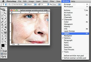
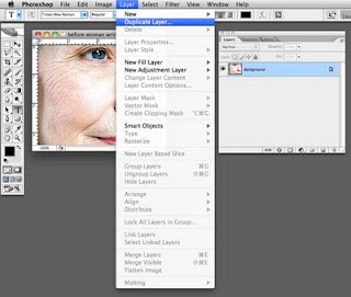
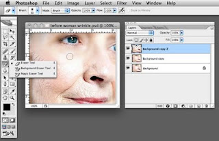
I work in "Layers" in Photoshop.


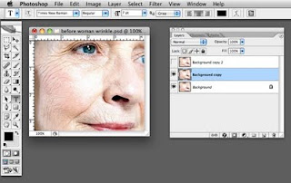
I create two duplicate layers of the original photo.


I turn off the "eye" on the top layer and highlight the second layer.


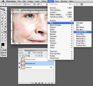
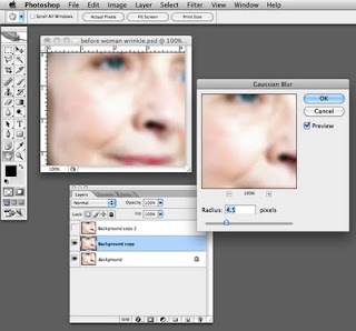
I select Gaussian Blur filter.


In order to demonstrate this I have exaggerated the filter.


Next I make the top layer visible and highlight it.

I'll then select the eraser tool to wipe out all the wrinkles - being careful to leave specific and detailed features - eyes, nose, mouth, hair, etc.


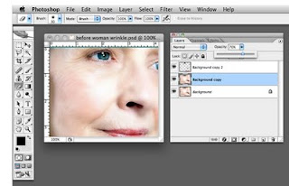
Then move to the middle layer and adjust the opacity.

Again, I have exaggerated here to make a point - but you want to make it "believable."


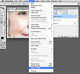
When you like the result, flatten the image.

Here's another example:


Before


And after!

How to Cope with a Really Bad Photo Reference


Bad reference photos happen and this is about how you can begin to make the best of it...

In a perfect world, I would only work with a great photo reference like the one below of Sara Lawrence Lightfoot. I took it in my studio with only a single source of light (like the light the Old Masters used).

Without any tweaking, this particular photo reference tells me pretty much what I need to know in order to paint Sara.

Obviously a good photo helps to make a good painting....the better the photo, the better the painting can be.


Then there are the problem reference photos we must work with because nothing else is available.

With the miracle of Photoshop, you may not need to resort to my "Studio Stress Reduction Kit."


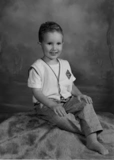
The little boy in the picture below is four and his mother wants to paint him at this particular age.

And alas, he has now grown up or my first suggestion would be for her to take another photo using a single source of light.

He's obviously a cute little guy but a reference like this is generally a nightmare. Here are some ways to allow yourself to "see" what you need to "see" in order to paint a decent portrait based on a poor photo reference.

(Note that I am not bothering to crop this into any other composition.)


This is the original full color photo.


This is the same photo desaturated (i.e., changed into Greyscale) in Photoshop. Color can confuse the eye and seeing value is most important here.


This is what I call the "Ansel Adams" approach to seeing a photo (above). This technique can sometimes salvage a poor photo or even make a mediocre photo look sensational:

Make a Layer in Photoshop. I used a Gaussian Blur Filter (12 pixels on this one) and adjusted the Brightness/Contrast to +15/+15.

Then fade this layer to about 35% and flatten the image. The result can sometimes give you a soft and glowing effect with softer transitions from light to shadow - much like an Ansel Adams photograph (tough to see here - sorry).


Here's another way to look:

I posterized a copy of the original grayscale photo to 5 levels above. I'm looking for pleasing patterns of light and shadow here - and a good solid abstract composition.


Posterized at 13 levels, you can see a more precise map of the distribution of value from highlight to deep shadow.


In this detail of the face, you can see where the centers of light are to be found and observe how light flows over the form.


A posterized detail of the arm shows how light plays on the form.


This is a close up detail of the unaltered face.

Sometimes we must paint what we know - and not merely what we see.

So I took some liberties to mess with reality below:


Photographs tend to clump values on both ends of the scale.

Therefore I reduced the contrast between the teeth and the inside of the mouth so it will end up looking more "normal" in the painting.

(Unless the subject is a small baby, I don't know any professional portrait artist who will paint an open mouth).


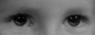
This is an eye detail of the face above showing how I added light to the iris and moved the highlights up. In a painting, this will make the eyes look more "real."

The source light comes from the upper right and the light (not highlight) reflected in the eyes is an opportunity to get the "color" right.

Note that under the clear lens of the eye, the iris is shaped like a shallow "concave dish" whose opposite rim catches light.

Also, I raised the existing highlights in the eye. This is a portrait painter's trick to make the child look "more intelligent" in the final painting.

Note that I always add highlights in the eyes after the surface is dry. It's easy to make someone look googly-eyed and it usually takes me a couple of tries before I get it right.

I like the option of wiping off the paint without wrecking the entire freshly-painted eye.


"Shrink the head" and read about why I do this. Because this is a child and his head is proportionally large, I don't shrink it very (much as shown above).


Painting plaid and other complicated patterns isn't as hard as you think. I added the Photoshop Gaussian Blur filter to make the light underneath the pattern easier to see.

First you will need to paint the cloth beneath the pattern and get the light and shadow right. Then paint the pattern.

I do hope this helps....


Manipulating the Original Reference Photos


Here's the finished portrait...


Portrait of Joanna
20" x 24" Oil on Linen

You might notice that I did not get a likeness above  (to the photo below) but I did get a likeness to the sitter, Joanna. There's a story here - read on.


This is the original reference photo I used. I took this photo in my studio without attempting to block any natural (indirect) daylight coming in the windows.

I used a Nikon D2X digital camera on a tripod and a Nikon Speedlight bounced into a white umbrella as my single light source.


This is a closeup of Lola the Pet Rat. When something in a photo doesn't "explain itself" - either force it to make sense - or just don't paint it.

There are "too many fingers" in this shot. I eliminated the unnecessary "extras."

I did not paint Lola's tail - it didn't make any sense in the photo and she looks OK in the painting without it.


You can see the "extra fingertips" eliminated in the final (detail) above. I think it makes more sense now.

Also, you can see that I turned the Antique snake bracelet around so it would "explain itself" and look like what it was in the final painting.


Also in the original reference photo, I did not like the skirt. It didn't drape nicely and wasn't interesting enough to paint.

So I took a white bed sheet and rearranged it with a similar light source. Then I photographed and "drew" it into the painting.

Now here's a glitch (and what portrait isn't without glitches?). In the final painting I had the "likeness" ....from the photo. But the photo "fibbed."

Joanna's face in my original reference photo looked uncharacteristically "fat." (I did not know this when I began the portrait.)


I had to "tweak the painting" until it finally looked more like the real person, Joanna, than the photo did. I used a combination of removing highlights and rearranging hair. I couldn't rearrange the anatomy (move ear,  jawline, etc.) - that would invite disaster bigtime.

Aaaaaaargh! Too bad we didn't see that in the beginning - groan - we could have easily chosen another photo to work with.