Showing posts with label How to use Old Master color banding. Show all posts

A Painter's Approach to "Blush"


If you are going for a realistic look in portraiture - ignore everything you know about applying makeup!

Beauty tips do NOT apply to the painting of a portrait.


Blush the cheeks with red, but keep it away from the nose and keep it low on the face - right down to the jaw line. 


My apologies to the Mona Lisa for using her face as a color map to show where the red really should go. 


Don't put any red on the forehead or the neck - be mindful of color banding as shown so well in George above.


Add your reds directly to the wet paint on your canvas - don't mix it first on your palette  first.


The nose and nostrils are warm.


And you can add some red on the upper lids of the eyes and in the inner corners and along the top of the lower lid.


You can add red from the lower jaw line right up to (but not beyond) the eyebrows.


Add lots of red to the ears.


You can add even more red to the shadow side of the face.


When you have blended the red in, the effect should be fairly subtle.


You don't want to add so much red that your face looks sunburned. Also, don't cover large unbroken areas in red or else it will look fake. 


You want to leave some areas red-free so there is some variety.


You can do the same thing for the hands and feet that you did for the face. You can use use quite a bit, especially on the soles of the feet, palms of the hands and fingertips. 


Red likes any place on the human body where the bone comes near the surface - elbows, knees, knuckles.


Sometimes it is easy to add more red to the face of a child than an adult.

I use a warm and a cool red: Indian Red and/or Alizarin Crimson Permanent.


Painting Skin Tones - One Layer at a Time


There's a Zen to painting in layers. 

You have got to enjoy the process or this isn't the method for you....(but don't worry, there are lots of ways to paint a portrait & get a similar result). Personally I like any way that is easy. And this is pretty easy - but alas, it isn't fast 'cause you just have to wait for those layers to dry before moving on.

"It is good to have an end to journey toward, but it is the journey that matters, in the end."
-Ursula K. LeGuin


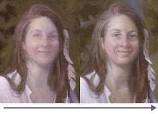
On the left side is a picture of the last completed layer (uncorrected). 

On the right is the current layer (uncorrected). 

That short journey from left to right is the subject of this little mini- demo on how to paint a layer on a face. (Of course, the same process works for hands, feet, all skin showing).

I use this method (multiple layers) to build light and form in small increments in order to get the luminosity of the Old Masters.

The more layers I paint - the more luminous it gets.

This example is only one of the many "middle layers" and merely illustrates a small (and relatively easy) step that goes into painting a portrait.

This particular face is small, only 3.25 inches high and this entire layer (shown) here only takes me half an hour (more or less). It is a lot easier and faster than it looks - really!

The hard part is waiting for my paint to dry so I can begin to build the next layer. 

While I wait, however, I work on background, clothing, props, other paintings, this blog, run errands, eat lunch...you get the idea.


This is the corrected face from the last demo on losing/finding a likeness. It is now ready for yet another layer.


I begin by reinforcing the lights (Titanium White) and the darks (Raw Umber thinned with Liquin) to increase the contrast. I try to avoid hard edges in this.

I let this dry thoroughly (i.e., overnight).


This is the palette I use in a layer. It does not matter if the skin tone is light or dark...the colors are the same but obviously the values will be different.


I mix/match the approximate skin tone (raw umber, burnt umber, raw sienna, titanium white), mix it with Liquin and scumble it over the entire face. 

Note that my paint is never so thick that I cannot see through it to the layer below.

See why I reinforced the darks & lights to bump up the contrast?


Into the wet surface, I add color. See my demo on Old Master Color Banding in Portraiture for particulars.


I blend those colors in.


This is how I mix "The Universal Color of Light."


I use this "Universal Color of Light" to build light on the face (or just about anywhere).

If the light looks chalky, I add more yellow.

If the light looks too yellow, I add more white.


I continue pulling the light down into the face. I am only working with light - not color.


I continue adding light. I locate and reinforce the centers of light with thicker paint.


I add more light, work it in and let the light build and define the form.


I continue to define the form with light.


I add even more light into the centers of light (as defined by the highlights).


I work this light in and build form. I allow the light to go into the hair.

This layer is done and it must be allowed to dry thoroughly.


I did correct the above pix, then went on and painted the next layer below.


ABOVE: Here is a peek at the next layer (uncorrected as to likeness, without a skin tone glaze and ill-defined features). The light is now so thick you cannot see the weave of the canvas through it. I've started to work on the hair. I wish this photo wasn't so small - it is really quite a jump forward.


This is a detail. You can see the color locked underneath as I build light on this face. 

Next:
I'll correct the likeness and define the features with raw umber and let it dry.
Next I'll glaze this back into a skin tone and let it dry.
Then I'll match a scumble to the skin tone and work color (bands) into the face
I'll let this dry - and repeat the process if necessary.

Considering how "unfinished" this stage looks right now, it is relatively quick and easy to transform a face with several layers of light into a finished face.


This is a detail showing how the light flows over the face with what is underneath still being visible. Do NOT paint around features like eyes, eyebrows - and don't be afraid to paint over the entire face in order to define the light. It is the paint that shows through that gives a painting its subtle beauty of form.

NOTE: I usually do the face LAST as the skin tones are really determined by what surrounds it (i.e., the background). So I'm going to stop working on the face now and bring the rest of this painting into being before I get all the color into this face.

I just keep repeating this entire layering process until the face tells me when it is time to stop and finish.

"Everything the same; everything distinct."
- Zen Proverb 

Old Master Color Banding in Portraiture


Color Bands are primary colors:

RED, YELLOW and/or BLUE.

They were used by the Old Masters to help make a painted face look "real." Heaven help the poor artist who gets a color band in the wrong place!

Remember that the primary color bands are "worked into" the existing skin tones - and into both light and shadow.

Alas, this is so difficult to see in a reproduction that I chose a detail of Sargent's "Lady Agnew" to exaggerate this technique so you can see it.

This really is easy to see if you go to a museum and look at portraits by the Old Masters. Sometimes when you know what to look for - you'll see it.

The best secrets of the Old Masters are hidden in plain sight.


This is an untouched detail of Lady Agnew - a portrait by John Singer Sargent. Alas, the color bands are in here - but they are much too subtle to see on this blog.

However, I "doctored" this below:


FACE BAND: RED

Face bands are in red (as in the example on the left). Even though it is exaggerated (Photoshop of course) it still looks "right."

From the eyebrows to the bottom of the chin, the color red is added to the face. I use either Indian Red and/or Alizarin Crimson Permanent...whatever "looks right."

Wrongly, yellow and blue were added to the other two faces above.


NECK & CHEST BAND: BLUE

In the neck and chest, blue is added as in the example on the far left. Where yellow and red are in the neck and chest, it looks clearly wrong.

I like to use French Ultramarine blue in the neck and chest.


FOREHEAD BAND: YELLOW

The forehead (from the top of the eyebrows to the hairline) has yellow ochre in it. You can see this correctly added on the far left.

Blue in the forehead will make the subject look ill and red will look "lobsterish."


Above is the doctored version of Lady Agnew with the correct, but exaggerated color bands.

Today I was working on a portrait and got to the very first color banding stage and thought you might like to see it.

This is how I do it:


This is sort of a funny stage so I need to tell you what you're looking at. I have already gotten a likeness, been through the "white stage' and glazed the skin tone with raw umber, raw sienna and burnt umber.

Then I scumbled (a thin milky skin tone) over the skin so what was underneath would still show.

Note that I have not put color in the eyes yet.

While my paint is still wet, I add Indian Red into the face. I make it more intense on the shadow side of the face.

Then I "work" that color in.


Next, I add yellow ochre pale onto the forehead and work that into the wet paint.


Finally I work French Ultramarine blue into the neck and chest.


All blended, it looks like this.

I will continue to work in layers, adding scumbles, building light and working more color banding into the face and neck until I am finished.

When I'm all done (don't hold your breath, it is a long process and I have a lot to paint) I'll post the finished portrait.

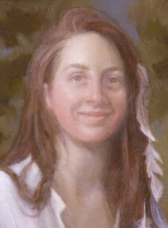
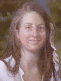
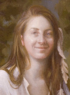
I painted the following four portraits exactly this way - hopefully you can see the color banding:


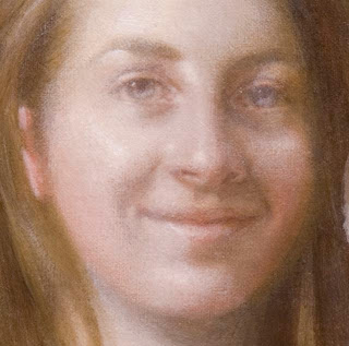
Whitney (detail).


Elizabeth (detail).


Zabie (detail).


Gwyneth (detail).


Rembrandt (as seen in this detail of one of his self portraits) obviously knew and used color banding.


John Singleton Copley (painting detail above) used color banding in this dark skin tone. Skin color doesn't matter - color bands are commonly used in virtually all of the Old Master's successfully painted skin tones.

Next time you're in a museum, check out the Old Master's skill in painting realistic faces using this method. You might have to stand there and stare for a while, but eventually you'll see those color bands.

I repeat, the best "secrets" always hide in plain sight...sometimes you just gotta look really hard.


And by the way, it isn't just the Old Masters that knew about Color banding - Modern Master Lucien Freud also uses this technique sometimes as seen in his portrait of Queen Elizabeth above.