Showing posts with label Tips and Tricks. Show all posts

Obvious Advice (for the Oblivious)


I keep this painting around the studio to remind myself that some lessons are really painful.


This is a detail of an oil sketch I did many years ago. In those days I was a bit too "casual" with my work and set this painting on the floor next to my easel to dry.

One day I discovered that I had managed to splatter paint all over it - which was dry and could not be removed.

Still . . . I left this work on the floor until a week later - my full-time-dog and part-time-art-critic evidently mistook this piece for a fire hydrant.

Sarge (named after John Singet Sargent) never did that again - thank heavens.

So the point of this story is: Treat your work with the respect it deserves and don't leave it laying around where it can get damaged.


How to Draw an Ellipe by Eye


I moved this up from an earlier posting as I have had so many questions about how this is done.


Knowing how to draw an accurate ellipse "by eye" can be an extremely useful tool...i.e., from rendering vases and teacups - not to mention its use in portraiture.

Here's how it is done:

Determine the outside dimensions of your ellipse with a rectangle.

Connect the corners of the rectangle with straight lines (CC).

Where these lines intersect is the center, point B.

Divide line BC into thirds by eye and mark with dots.

Point D is the outermost dot and will be moved verrrry slightly outward so that it is a little less than 1/3.

Mark the center of the sides of the rectangle (Point A).

With a dotted curved line, the elipse will only touch the rectangle at Point A and pass through Point D.


Thank heavens this works with any perspective view too and that is when you REALLY need it.

NOTE:

When drawing a circle or any curve, it will always be easier to be accurate if you use a dotted line rather than a solid line first.

How to Cope with a Really Bad Photo Reference


Bad reference photos happen and this is about how you can begin to make the best of it...

In a perfect world, I would only work with a great photo reference like the one below of Sara Lawrence Lightfoot. I took it in my studio with only a single source of light (like the light the Old Masters used).

Without any tweaking, this particular photo reference tells me pretty much what I need to know in order to paint Sara.

Obviously a good photo helps to make a good painting....the better the photo, the better the painting can be.


Then there are the problem reference photos we must work with because nothing else is available.

With the miracle of Photoshop, you may not need to resort to my "Studio Stress Reduction Kit."


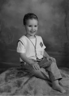
The little boy in the picture below is four and his mother wants to paint him at this particular age.

And alas, he has now grown up or my first suggestion would be for her to take another photo using a single source of light.

He's obviously a cute little guy but a reference like this is generally a nightmare. Here are some ways to allow yourself to "see" what you need to "see" in order to paint a decent portrait based on a poor photo reference.

(Note that I am not bothering to crop this into any other composition.)


This is the original full color photo.


This is the same photo desaturated (i.e., changed into Greyscale) in Photoshop. Color can confuse the eye and seeing value is most important here.


This is what I call the "Ansel Adams" approach to seeing a photo (above). This technique can sometimes salvage a poor photo or even make a mediocre photo look sensational:

Make a Layer in Photoshop. I used a Gaussian Blur Filter (12 pixels on this one) and adjusted the Brightness/Contrast to +15/+15.

Then fade this layer to about 35% and flatten the image. The result can sometimes give you a soft and glowing effect with softer transitions from light to shadow - much like an Ansel Adams photograph (tough to see here - sorry).


Here's another way to look:

I posterized a copy of the original grayscale photo to 5 levels above. I'm looking for pleasing patterns of light and shadow here - and a good solid abstract composition.


Posterized at 13 levels, you can see a more precise map of the distribution of value from highlight to deep shadow.


In this detail of the face, you can see where the centers of light are to be found and observe how light flows over the form.


A posterized detail of the arm shows how light plays on the form.


This is a close up detail of the unaltered face.

Sometimes we must paint what we know - and not merely what we see.

So I took some liberties to mess with reality below:


Photographs tend to clump values on both ends of the scale.

Therefore I reduced the contrast between the teeth and the inside of the mouth so it will end up looking more "normal" in the painting.

(Unless the subject is a small baby, I don't know any professional portrait artist who will paint an open mouth).


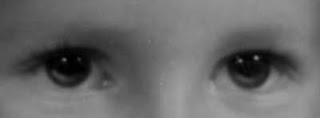
This is an eye detail of the face above showing how I added light to the iris and moved the highlights up. In a painting, this will make the eyes look more "real."

The source light comes from the upper right and the light (not highlight) reflected in the eyes is an opportunity to get the "color" right.

Note that under the clear lens of the eye, the iris is shaped like a shallow "concave dish" whose opposite rim catches light.

Also, I raised the existing highlights in the eye. This is a portrait painter's trick to make the child look "more intelligent" in the final painting.

Note that I always add highlights in the eyes after the surface is dry. It's easy to make someone look googly-eyed and it usually takes me a couple of tries before I get it right.

I like the option of wiping off the paint without wrecking the entire freshly-painted eye.


"Shrink the head" and read about why I do this. Because this is a child and his head is proportionally large, I don't shrink it very (much as shown above).


Painting plaid and other complicated patterns isn't as hard as you think. I added the Photoshop Gaussian Blur filter to make the light underneath the pattern easier to see.

First you will need to paint the cloth beneath the pattern and get the light and shadow right. Then paint the pattern.

I do hope this helps....


A Studio In My Pocket

Lord, I love a gadget!

In those salad years I carried a sketchbook nearly everywhere I went. Now I'm thinking how useful this little sketchbook device would have been too.


The three paintings just above and below have been done on the iPhone.

An app called "Brushes" is the medium.


The program is simple but the result can be rather sophisticated.


These three paintings above are samples from the Brushes Gallery. (I don't know the names of these artists but will post them when I find out).

The paintings below are by Jorge Colombo:


He painted it on his iPhone with an app called "Brushes."


Jorge Colombo has been working with watercolors and pens for decades.

But his latest tool, the iPhone app Brushes, has landed him a spot on the cover of The New Yorker Magazine.


Colombo's picture is of one of those street carts that sell hot dogs and pretzels in the heart of New York's Time Square. He stood there and painted it using his iPhone.

"Brushes" is available for download at the Apple App Store.

It only costs five bucks - who could resist?


Jorge Colombo

I think the best feature of this is that it doesn’t feel like something that was done digitally - it is quite the opposite."


Jorge Colombo

It is a bit like finger painting - using finger strokes on the tiny iPhone screen.


Colombo drew this painting within an hour while standing in line outside Madame Tussaud's Wax Museum in Times Square.

A brand new, no mess, no cleanup, no fuss quickie art form. You can stand there in public and not attract any attention whatsoever as you paint. For all the world knows you're just playing Solitaire.


Jorge Colombo

The Brushes app works on both the iPod Touch and the iPhone.


Marc Scheff did the above portrait on his iPhone.


Here's how Marc did the little movie (link above).


iPhone paintings were completely new to me until I read about them in Robert Genn's Twice-Weekly Newsletter. You can Subscribe free.

Genn's website The Painter's Keys is a great resource for painters. I go there often to browse.

Thanks Robert!

Is Your Palette Right Side Up?

It makes me nuts. (And some days it doesn't take much.)


Upside down palettes.


Here's an upside down palette from a stock photo house. This silly palette is guaranteed to hurt your thumb and get paint all over your hands and clothing.

And besides that's an awful lot of paint laid out on such a small palette, isn't it?


I took this picture of the upside down palette above in the studio in the Rembrandt House Museum in Amsterdam.


The great artist's house and studio are loving and meticulously recreated....but it appears that somebody neglected to consult a real painter before setting up this particular display.


I've seen people who have painted with upside down palettes for years. And that can cause some serious thumb-pain.


Here's how it looks when a right handed artist is holding his palette correctly in his left hand - right side up.


Michael Balsley at Turtlewood (business card above) made my favorite large (counter weighted) studio palette.

A comfy palette can be tough to find and Turtlewood makes a large variety of the best. I can paint all day and my hand won't hurt.


If the artist is right handed (palette for holding in in left hand shown above), he or she will hold the palette, brushes, rag and mahl stick in the left hand and paint with the right hand.

There are also left-handed palettes and flipping a right handed palette over doesn't work.


Palettes come in all shapes and sizes. Note that the thumbhole is cut at a slant for comfort when the above palette is being held in the left hand.


Here it is again: the above pix shows two rectangular right side up palettes that are to be used by a right-handed person who holds a palette in the left hand. The thumb holes are always cut at a slant for comfort.

Also note: some artists like to make their own palettes. Nice idea and I don't discourage it. But make sure that if that palette is to be held, make it as light weight as possible or a fun day of painting could necessitate ice packs applied to the thumb by the end of the day.

So now you know that it matters which side of your palette you put the paint on. If you forget, your thumb will hurt, you'll get paint on yourself and it will be generally uncomfortable.

No more excuses.

A Common Studio Frustration


So how do I keep lint, dust, dirt and cat hair out of my paint?


Easy.


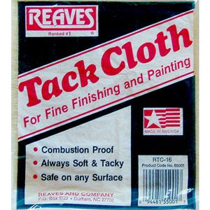
I start with a tack cloth - any brand will do. You get them from your local hardware or paint store.


Out of its package, my tack cloth looks like this (above).

The tack Cloth (sometimes called a Tack Rag) is a (cheap) reusable cloth impregnated with beeswax and it gobbles up dust. You wipe the dry surface of your canvas and your palette before you begin to paint.

You can also wipe down your easel (especially the tray in front).

Keep it fresh between uses in a zip-loc plastic baggie.


You can skip my Stress Reduction Kit above and buy some Shop Towels instead.


I usually buy them by the case at an auto supply store or the car section in a large store (i.e., WalMart). Lint free paper towels also come in a large box but I prefer the rolls as they are easier to store.


Out of the package, a Shop Towel roll looks like this. It is an ugly bright blue but is totally lint free. Always use them to wipe your brushes.

Using ordinary paper towels, you will eventually cause a significant buildup of lint in your paint.


Still frustrated?

Also try this:

1. ALWAYS hang your wet paintings vertically on a wall to dry.

2. Do NOT lay a wet painting flat on a surface (like a tabletop) to collect dust as it dries. 

3. Do not rest a wet painting on the floor.

4. Damp mop your studio floor (or vacuum) as often as necessary to pick up dust.

5. Use an air cleaner - the "Ion" type is best.

Do what you can. It all helps. 

And know that dirt and other things that don't belong in paint was a common problem for the Old Masters too. 


Go to any large museum and find some of those gigantic epic paintings and take a close look at the surface of the paint. 

I remember seeing (at the Musee du Louvre shown above) all kinds of nasty things (like remains of bugs, fingerprints, dog hair) that embedded themselves in thick wet (probably slow-drying)  paint centuries ago.