
Bad reference photos happen and this is about how you can begin to make the best of it...
In a perfect world, I would only work with a great photo reference like the one below of Sara Lawrence Lightfoot. I took it in my studio with only a single source of light (like the light the Old Masters used).
Without any tweaking, this particular photo reference tells me pretty much what I need to know in order to paint Sara.
Obviously a good photo helps to make a good painting....the better the photo, the better the painting can be.

Then there are the problem reference photos we must work with because nothing else is available.
With the miracle of Photoshop, you may not need to resort to my "Studio Stress Reduction Kit."

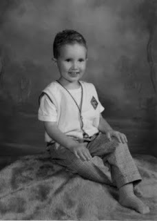
The little boy in the picture below is four and his mother wants to paint him at this particular age.
And alas, he has now grown up or my first suggestion would be for her to take another photo using a single source of light.
He's obviously a cute little guy but a reference like this is generally a nightmare. Here are some ways to allow yourself to "see" what you need to "see" in order to paint a decent portrait based on a poor photo reference.
(Note that I am not bothering to crop this into any other composition.)

This is the original full color photo.

This is the same photo desaturated (i.e., changed into Greyscale) in Photoshop. Color can confuse the eye and seeing value is most important here.
This is what I call the "Ansel Adams" approach to seeing a photo (above). This technique can sometimes salvage a poor photo or even make a mediocre photo look sensational:
Make a Layer in Photoshop. I used a Gaussian Blur Filter (12 pixels on this one) and adjusted the Brightness/Contrast to +15/+15.
Then fade this layer to about 35% and flatten the image. The result can sometimes give you a soft and glowing effect with softer transitions from light to shadow - much like an Ansel Adams photograph (tough to see here - sorry).

Here's another way to look:
I posterized a copy of the original grayscale photo to 5 levels above. I'm looking for pleasing patterns of light and shadow here - and a good solid abstract composition.

Posterized at 13 levels, you can see a more precise map of the distribution of value from highlight to deep shadow.

In this detail of the face, you can see where the centers of light are to be found and observe how light flows over the form.

A posterized detail of the arm shows how light plays on the form.

This is a close up detail of the unaltered face.
Sometimes we must paint what we know - and not merely what we see.
So I took some liberties to mess with reality below:

Photographs tend to clump values on both ends of the scale.
Therefore I reduced the contrast between the teeth and the inside of the mouth so it will end up looking more "normal" in the painting.
(Unless the subject is a small baby, I don't know any professional portrait artist who will paint an open mouth).
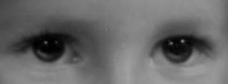
This is an eye detail of the face above showing how I added light to the iris and moved the highlights up. In a painting, this will make the eyes look more "real."
The source light comes from the upper right and the light (not highlight) reflected in the eyes is an opportunity to get the "color" right.
Note that under the clear lens of the eye, the iris is shaped like a shallow "concave dish" whose opposite rim catches light.
Also, I raised the existing highlights in the eye. This is a portrait painter's trick to make the child look "more intelligent" in the final painting.
Note that I always add highlights in the eyes after the surface is dry. It's easy to make someone look googly-eyed and it usually takes me a couple of tries before I get it right.
I like the option of wiping off the paint without wrecking the entire freshly-painted eye.

"Shrink the head" and read about why I do this. Because this is a child and his head is proportionally large, I don't shrink it very (much as shown above).

Painting plaid and other complicated patterns isn't as hard as you think. I added the Photoshop Gaussian Blur filter to make the light underneath the pattern easier to see.
First you will need to paint the cloth beneath the pattern and get the light and shadow right. Then paint the pattern.
I do hope this helps....


3 comments:
This is SO helpful! I'm teaching myself to paint, and I'm using photos, and they have, basically, too much information. I like your method of desaturating and posterizing, to see the shades of tones....
your website is full of helpful insight- thank you so much for sharing!
And thank you for your kind (if anonymous) words.
All Best,
Karin
I also found it helpful for drawing with pencils, as using a bad quality reference photo can be guite confuzing sometimes :)
Thanks a lot! :D
Post a Comment