
It is said that "if someone can learn to really see, they could easily learn to paint and draw like the Old Masters."
I tend to agree with this.
A reader sent me a WIP (work in progress that she is struggling with).
She's not that far off and she can easily correct her painting when she can "really see" what is wrong.

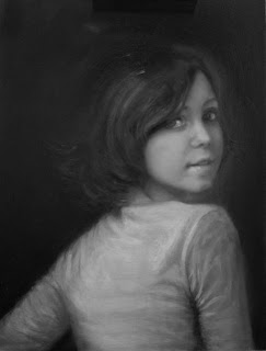
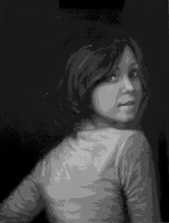
Above is her painting so far and the original reference she is using. I'm NOT going to critique the original photo - that is another subject completely. (But a good reference photo has certain criteria makes painting a lot easier).
So, with a digital camera, a computer and Photoshop (there is other softwares that also work) you can begin to "see for yourself."
(There's a "low tech" solution at the end of this post if you need it.)*
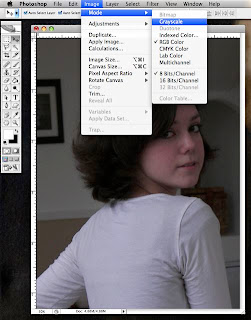
Color can get in the way and be confusing so the first step is to get rid of it.
I removed all color via Photoshop.
Value and patterns of value (sans color) are the places to begin when you're clearly in trouble.

I converted her Original Reference to greyscale (above).
Note how "soft" it is as the light gently flows down the figure. The lightest object is the shirt, then the face. The hair is the darkest. The background is lighter in value than the hair and defines the overall shape of the hair - a nice design element in this picture.
In this WIP, the face and shirt are of equal value. The value of the hair is broken with too much light and isn't defined as a distinct shape from the value of the background.
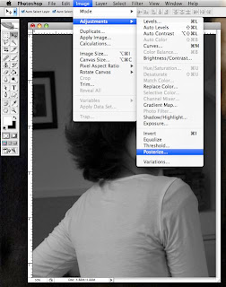
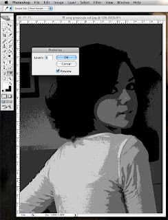
You can see the Photoshop process above as I posterized the original greyscale reference into 11 levels of value.
I could have chosen any number of levels that clearly shows the center of light and how the light and shadow is distributed on each object.
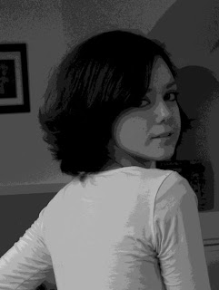
Note that there is a specific pattern of light on the hair.
The lightest value (highlight) on the face is on the side of the nose.
The secondary light is confined to the near side of the nose, cheek and chin. ALL other light on the face and neck are NOT as light as these.
Form is determined by how light turns into shadow. This is called the halftone (neither light nor shadow). You can see how the halftone describes the far cheek and chin.
If you can accurately paint the halftone, your painting will be essentially finished!
In the 11 level posterization of the WIP, you can see that the distribution of the light and dark values of the general objects (face, shirt, hair) are incorrect in relation to each other.
Also, within each object respectively, the light and shadow patterns differ from the original reference material.
Of course, you can use a photo as a mere reference or "suggestion" but if you want to paint more or less realistically, you cannot reinvent the rules of light until you understand them.
Playing in Photoshop is a good way to "see." The above pix shows a screen shot of my computer when I turned the original reference into a 6 level posterization. The lower levels will give you more of an "abstract view. "
And a really good abstraction is the best foundation for any painting.
*But don't despair if you're not a techie, here's a LOW TECH solution for you:
Before I got a computer and went nuts learning Photoshop, I used to take a transparent sheet of red acetate (Office Supply Stores sell them as "report covers") and put it over a colored photograph.
The red acetate will eliminate the color beneath and reveal the values. Any red lens or red glass will do this also.


3 comments:
Great information, Karin! Thank you so much! Yes, the photo, isn't the best. Photoshop is such a wonderful modern artist tool. I can't wait to resolve this one. Quick question, (and I think as I write may figure the answer) How would does one paint the "white" shirt in the correct value without taking the "center stage" away from the model? Is it a warm/cool, saturated/grayed down solution?
A plain white shirt can certainly take center stage and is tough to paint.
However, some white near the face usually helps a portrait...think drape and folds and interesting geometry.
This is where a good reference photo really counts - resolve the problem with the camera BEFORE you ever pick up a brush.
It is easy to look at a photo of a very pretty and appealing subject and not see the problems with translating this into a good painting - until you've done it a few times.
It isn't a warm/cool thing. Just keep the lightest values away from the edges of your canvas so as not to draw the eye away from the subject matter.
Excellent tutorial and Excellent Advice! I love working in photoshop but never thought to use it to check my values. I printed this tutorial and I am starting a notebook filled with your wonderful posts. Thank you, Karin!
Susan
Over at "RaisinToast"
Post a Comment