From 1692 - An Old Dutch Book on Color Mixing

In 1692 an artist known only as “A. Boogert” sat down to write a book in Dutch about mixing watercolors.


Not only would he begin the book with a bit about the use of color in painting, but would go on to explain how to create certain hues and change the tone by adding one, two, or three parts of water. 


The premise sounds simple enough, but the final product is almost unfathomable in its detail and scope. Spanning nearly 800 completely handwritten (and painted) pages, Traité des couleurs servant à la peinture à l’eau, was probably the most comprehensive guide to paint and color of its time. 


According to Medieval book historian Erik Kwakkel who translated part of the introduction, the color book was intended as an educational guide. 


The irony being there was only a single copy that was probably seen by very few eyes. 


It’s hard not to compare the hundreds of pages of color to its contemporary equivalent, the Pantone Color Guide, which wouldn’t be published for the first time until 1963. 


The entire book is viewable in high resolution here, and you can read a description of it here (apparently this website crashes easily but I have gotten it and if you want to see this book, it is worth trying again and again). The book is currently kept at the Bibliothèque Méjanes in Aix-en-Provence, France.

Just for Fun


By Danish Cartoonist Herluf Bidstrup

The #1 Job of a Portrait Painter


There is a real art to taking a good photographic reference for a portrait.

Costume, props, pose and a few (surprising to some) rules will help turn the ordinary into the extraordinary.

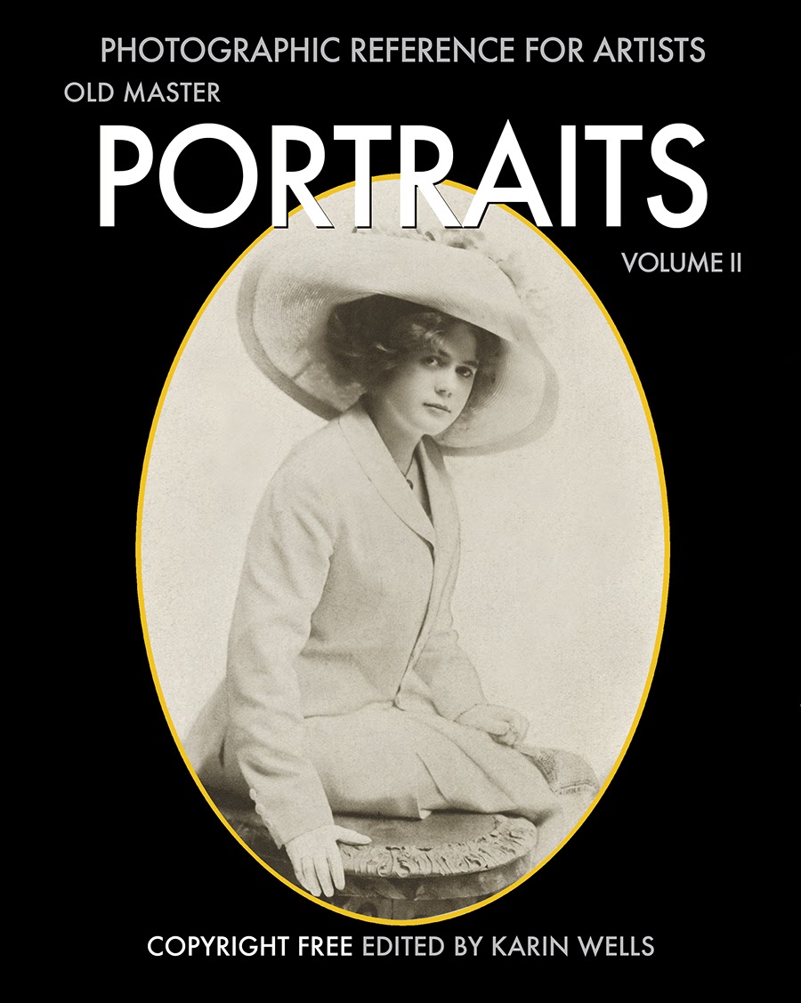
There are nearly 200 pages of copyright free photographic reference material in Old Master Portraits, Volume I 


Here's a little peek at a few... 
(sorry they are so darn small).


OLD MASTER PORTRAITS, VOLUME I, Photographic Reference for Artists

Copyright Free Photographic Reference For Artists ~ now on iBooks 


I use these photos to make sketches ~ to study lighting and work out interesting shadow patterns for paintings.

As in this drawing above (from photo in Volume I, page 19), I usually draw on toned paper since I paint on a toned canvas. This is cheap brown typewriter paper I found in a stationery store. Oftentimes I draw on brown wrapping paper as I like the tooth and the tone.

If I were drawing to figure out a likeness, I'd use a larger paper (this is only 7" high).


This is the first half of a beautiful collection of rare vintage photographic portraits of stage actors that were originally published in 1911. 


As as body of work, they offer some stunning and insightful lessons to enable us to recreate the nearly lost art of classical portraiture. 


These old-time photographers knew how to use a camera’s lens - like the Old Master painters used a brush. 


They could turn an ordinary person into an extraordinarily beautiful picture. 

The introduction to this collections, points out what to look for, what they knew, and how they accomplished these masterful portraits. 


I'll repeat some of this as a separate post for those of you who cannot access iBooks.

 Copy them. Study the lighting and the pose. Examine the costumes, props and settings. Understand why these photos are so good and let them inspire your work.

And yes, there are photos of men too... but because of the costumes, they just aren't as "interesting."


This book is way to big for this blog... nearly 300 pages of delicious Old Portraits.  Thus I am offering my iBook as a way to reach more artists because I have found good reference material very useful.

The technology just isn't there for devices other than the iPad with iBooks 3 or later and iOS 5.1 or later, or a Mac with iBooks 1.0 or later and OS X 10.9 or later.

The cost of a print book would be astronomical and the iBook (although it is a lot of work on my end) can be owned for the price of a fancy greeing card ($4,99 USD).

All images are copyright free for artists to study and use.

Enjoy!


The iPad is the Best Tool in my Studio


Painting from life is a luxury that many of us don't have. 

The backlit photograph is so much better than a printed photo to display photographic details of a subtle range of value. 

 I load my iPad with reference photos, clip it to my easel and I’m ready to paint. 

 Here's how to take a screen shot of any page ~ like this:


 First, make sure your screen is at its brightest setting. 

Press the POWER button at the top right of the iPad and the HOME button at the bottom of the screen at the same time for a second. You’ll see the screen flash white for an instant and you’ll hear the camera shutter sound. 

That’s it. Simple. 

Here is a screen shot I just took from my iBook, Old Master Portraits Volume I


Once you’ve done that, you can go to the Photos app and see your screenshot in the Camera Roll Album. From there you can use iCloud, email it to yourself and/or play with it on your computer if you wish. 

Here's another screen shot from my iBook:


On your iPad, you can enlarge or manipulate it with an app like InstaEditor, (one of many free photo apps available).

The iPad has a Kindle App for book reading...but if you want to view beautiful photos too, consider the iPad. 

The average Kindle reader (Kindle, Android, etc.) tends to display a poor quality photo in a mere 16 shades of gray (yuck).  I am sure that the technology will someday catch up to the current iPad.

I do believe that even Apple does not yet fully understand the possiilities of their iPad's use in the field of art. It really is the electronic gadget for those of us who are visual.

The Ideal Reference Photo for a Painting

Are you trying to make a good painting from a poor photo reference? If so, it might be time to improve your photographic skills. 

Bill Gekas can inspire you. He is an Australia-based photographer who has a real knack for portrait photos. And we can learn a lot about photos by looking carefully at his work.


His work is an homage to many Old Masters of classic paintings, including artists like Vemeer and Rembrandt.


Gekas recreates many mid-18th century settings that are inspired by the painted portraits of the Old Masters.


 He uses props and costume to fit the time period and duplicates the single source of lightthat the Old Masters used. (In other words, there are no cross-shadows from light coming from different directions.)


The self-taught photographer learned on 35mm film camera and has since turned to digital techniques. 


He uses "post-processing" (Photoshop) to put the final touches on each of his photographs.


These photographs are the result of hard work, experimentation, and a grand vision. 


His style is unique and is based on the Old Masters.


Bill Gekas has some sage advice: 

"Don’t be scared of taking certain elements from different works and molding them into something to call your own. You might like the lighting from a photo you saw somewhere, a prop from another photo, colors from another."

"The key is not to limit yourself with the excuse, ‘It’s all been done before.’ Yes, many things have been done before, but with some careful thought you can adjust a concept to give it your signature. Experiment!”


I think that any painter who wants to do portraits, really needs to experiment with photography. They need to learn how to produce a beautiful photo using a single source of light (by far the most important element in this entire post).


I know that so many artists claim "that you must paint from life." 

I say, "baloney to that and it isn't practical - or sane." For Pete's sake, Vermeer used the Camera Obscura? (One wonders if these folks want the beginner to fail?)

So, you have my permission to use a photograph for reference and you can quote me on my hotly contested advice. 

Not only do I photograph people for paintings, I photograph my still life. 

Because, for example, a peach left in a warm studio for a couple of days will attract flies - yuck. I say it's better to take the photo and eat the peach while it is still fresh.


Could you imagine any model sitting or standing still long enough for you to paint a portrait that is as detailed as an Old Master painting? 

It would be difficult for an adult - but for a child? Never ~ it might be considered abuse.


I'd predict that the expression of a sitter would quickly reflect boredom or annoyance in a very short period of time. 

Just look at the alert expression in these photos. It only takes a second to capture with a camera ~ but it is what you want for a portrait.

Drapes and folds that change each time the model moves would drive me insane.


Shadows are important design elements in a painting and need to be carefully and thoughtfully.


Often, I combine bits and pieces from multiple photos shot at one sitting. I seldom "get it right" in one shot - although the more I shoot, the better I tend to get. 

 Bill Gekas' beautiful 5-year-old daughter stars in his Old Masters' painting-like photos. I found them online here.

And before you ask~ NO ~ you cannot make paintings from another person's photo without his or her express permission. But you can study the process and work on making your own unique photos of people and still life to use as reference.

Happy shooting!

Art begs you to notice it. Why?


"Art begs you to notice it." 

"Why? Because art is God's way of saying hello. So pay attention to poetry. Pay attention to music. Pay attention to paintings and sculptures and photo exhibits and ballets and plays. Don't let all this go unnoticed." 

 "Your world is shouting out to you, revealing something intrinsically glorious about itself. Listen carefully. Love art, the way art loves Life."

~ excerpt from the writings of Neale Donald Walsch


The paintings above are: 
"Madame Mette Gauguin" by Paul Gauguin 
and "Mary Simone" by Mary Cassatt

An Old Art Lesson

Way back in 1958, four Disney artists demonstrate their various painting techniques through a nature study. 

 We can still learn a lot from this.


I found the approach of these working artists, and their methods and materials (oil paint and lighter fluid? yikes!) to be most interesting. 

The Art Spirit by Robert Henri is a classic and most working artists I know have read it at one time or another.

This book invites reading time and time again. It brings us back to the principles. The value of things. Right thinking. Relationships. Some things never change.

PSA Spoof: "Talk to your Kids about Art School"

There is always a bit of truth in humor - which is why these spoof ads are so darn funny. 


Young artists are addicted, they spend hours and hours perfecting their craft. They can’t help 
themselves. 


Their parents are generally less enthused with their child’s artistic aspirations, wishing they’d go to school to become a doctor or a lawyer instead.


The College for Creative Studies “Talk to your kids about art school” campaign plays up the duality of this relationship by mimicking anti-drug PSA’s.


"Ads for College Creative Studies" - found online here.


KOO SCHADLER: "Creating Compelling Images"


The April/May 2013 issue of  "International Artist" Magazine has an in-depth interview with my friend Koo Schadler. She is a master of the egg tempera medium. She and I both share the same teachers, Numael and Shirley Pulido of Hancock, New Hampshire. 

Koo gives workshops in Egg Tempera and has written an excellent book that explains this medium and her techniques in great detail.

Whatever the medium - oil, pastel, egg tempera - the principles of Old Master Painting are the same.

I found this article to be well worth reading (click page to enlarge).


One of the sections left out of this article was small but, to Koo, relevant because it described 
(in brief - there was a word limit) 
how her working methods in tempera differ from the usual ways people work in tempera:

Question by Lauren Mills: 
"How would you describe your working method in tempera?"

Koo Schadler: 
"Two ways of working in egg tempera are generally taught: the Italian method as described by Cennini, and the Greek method used by icon painters. Each is a systematic, logical working method that produces excellent results.  However there are other ways to work in tempera.

I begin with a carefully considered drawing to arrange the values, colors, shapes, lines, etc. into a visually strong image.  Once I’ve decided upon the design I dive into the painting.  I use a variety of techniques - thick paint, thin paint, brushwork, sponges, glazes, scumbles, splatters, stencils, rubber stamps, and more.  

I don’t apply these techniques in a strictly premeditated way, but instead use whichever is needed to achieve the intended goal, as outlined in my design.  It is a direct and improvisational way to paint.  It suits my nature and goals."